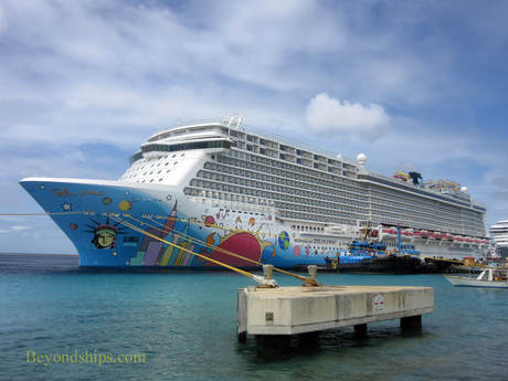
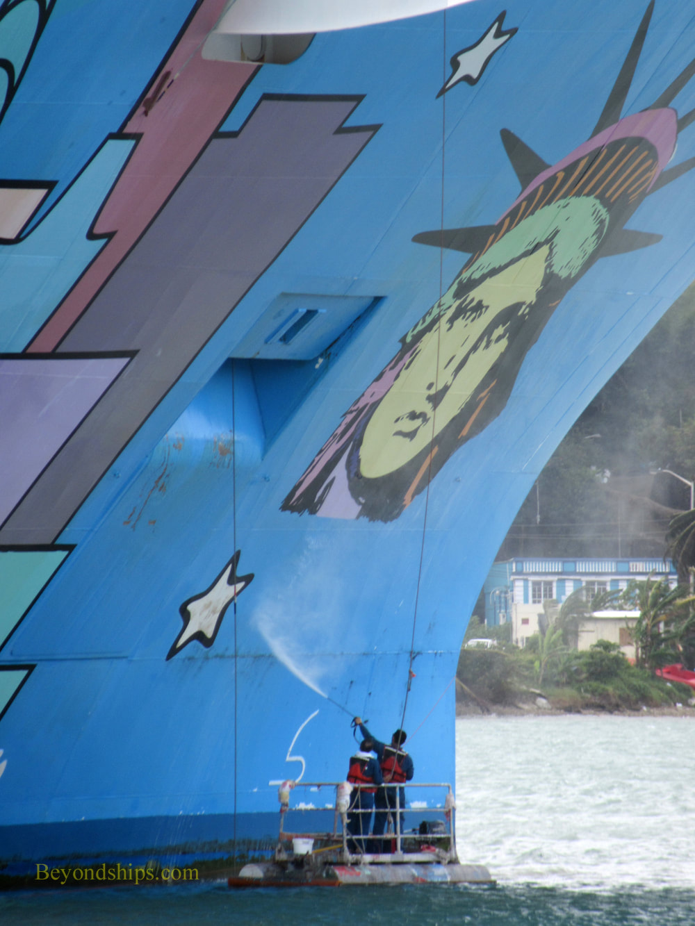
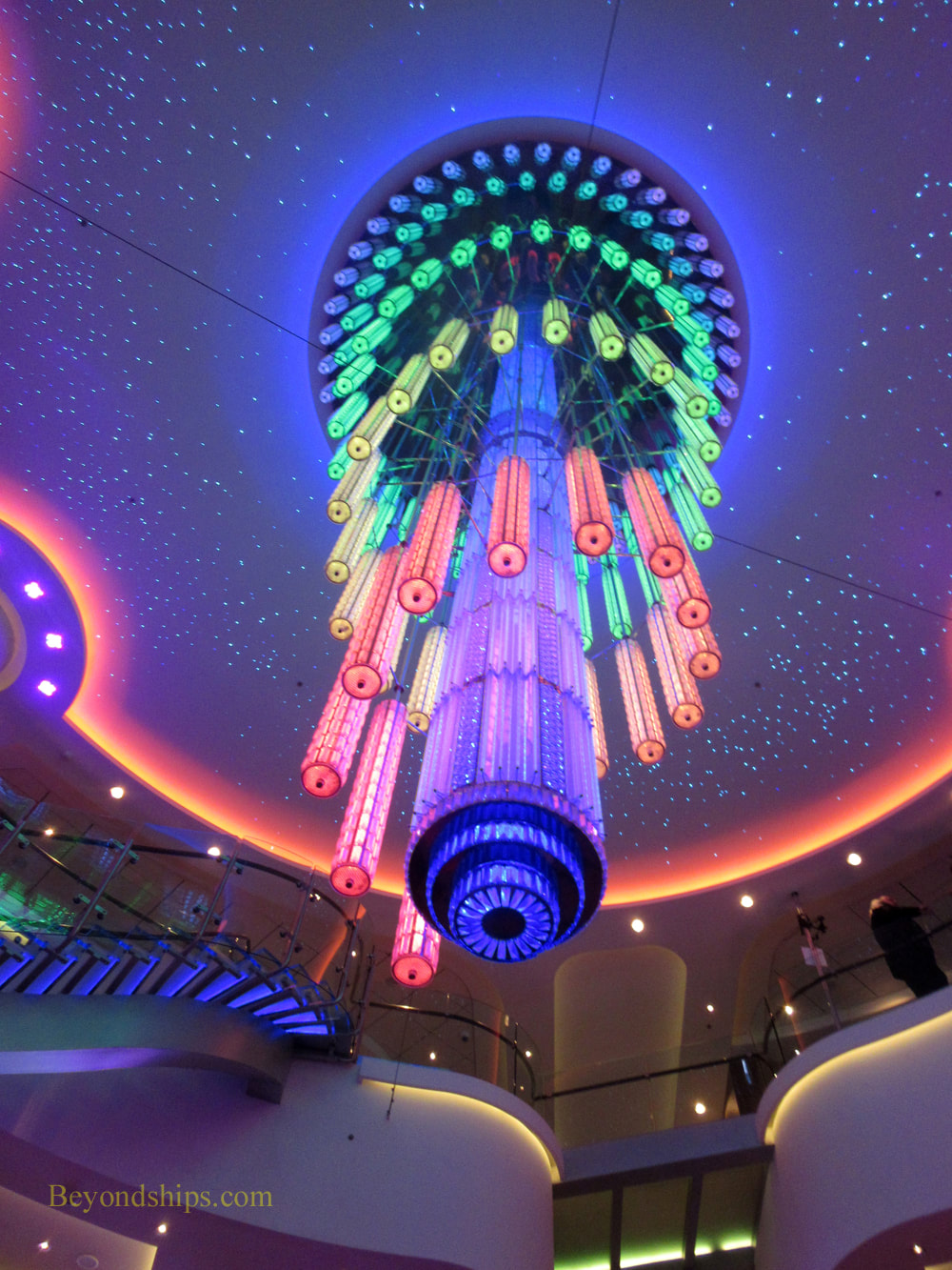
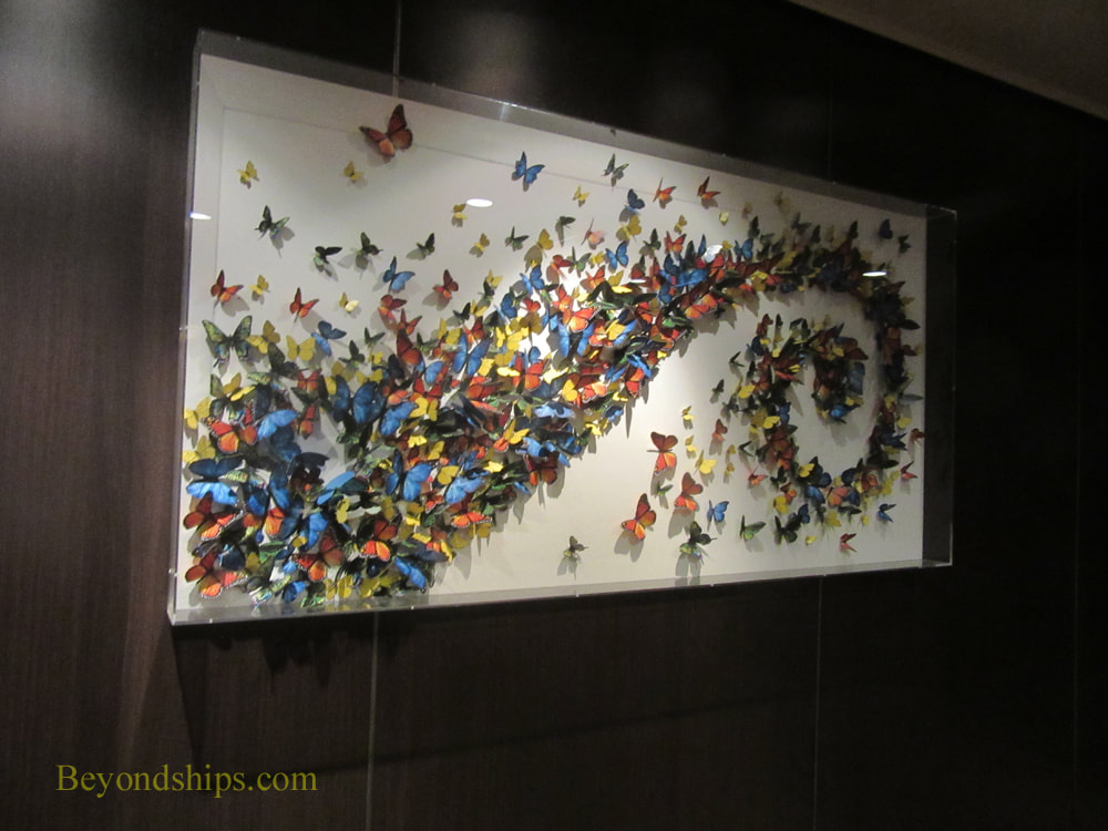
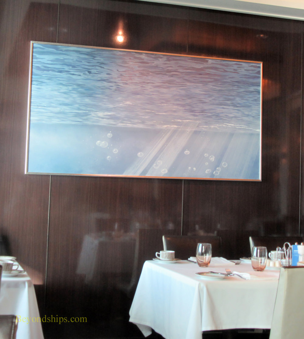
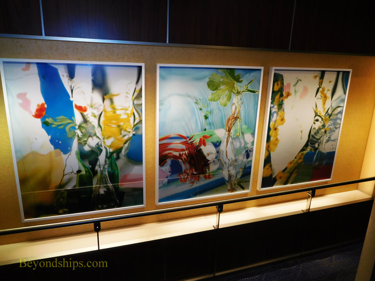
 The centerpiece of Norwegian Breakaway's art collection is not hard to find. It is a work by Peter Max which covers 40,000 square feet of the ship's hull. "The artwork is a composite of New York City and cosmic imagery - -the Statue of Liberty, the Manhattan skyline, a giant sunburst, planets, stars, and musical notes. That's my New York! And now Norwegian Breakaway is my New York cruise ship 'canvas.'" Mr. Max has explained. Although several of the Norwegian Cruise Line ships that preceded Breakaway had colorful murals painted on their hulls, Breakaway was the first ship to have a mural by a well-known established artist on her hull. Mr. Max rose to prominence in the 1960s with his pop art images that captured the spirit of the psychedelic 60s. From that base, he continued to develop a distinctive colorful style through series involving images of the Statue of Liberty and the American flag as well as celebrity portraits. He has also found commercial success being designated Official Artist of five Super Bowls, six Grammy Awards, World Cup USA, The World Series, the United Nations Earth Summit, and numerous other events. His work has also been reproduced on the cover of the Yellow Pages and on a U.S. Postage stamp. The Breakaway project was not Mr. Max's first large scale work. Prior to undertaking the project for Norwegian, he had painted a 777 airliner for Continental Airlines and had designed a 600 foot stage for the Woodstock Music Festival. Of course, Mr. Max did not take a sable-hair brush down to the Manhattan piers and paint the sides of the ship. Rather, he created the design for the work which was then reproduced on the hull of the ship when it was under construction at the Meyer Werft shipyard in Germany. Being outdoors, subject to ocean waves and the blasting of salt spray, Mr. Max's mural is in a hostile environment. In order to maintain the work, Breakaway's crew regularly sprays the hull with fresh water to remove the accumulated salt. When the ship is in port, standing on rafts and using long handled rollers, they also re-touch the paint. This work is done by the sailors of Breakaway's deck department. Mr. Max did not confine his vision to off-the-shelf colors of marine paint. Therefore, Breakaway carries a supply of unique colors needed to maintain the mural. You also see images by Mr. Max inside the ship. Breakaway devotes a considerable amount of its public space to Park West Galleries, which sells works by Mr. Max as well as works by other artists. Naturally, given the ship's connection to Mr. Max, his works are often featured and on display. However, these works belong to the concessionaire rather than to the ship. Finding works that belong to the ship is more difficult, The staircases and elevator lobbies where cruise ships often display their art collections are decorated with mirrors and photographic images of travel destinations on Breakaway. There are reproductions and photographs in the various specialty restaurants and bars. However, these are part of the décor of those venues rather than a serious art collection. But there is an art collection. There is a giant modern chandelier in the atrium that pulses and changes colors in a variety of combinations creating different images and atmospheres. Forward on one of the public decks is an installation with (paper?) butterflies in a cornucopia shape. Also, in the Taste and Savor restaurants are a number of contemporary paintings that appear to be originals. I liked a series of paintings in Taste that look like monochromatic abstractions at first glance but on further study are scenes looking up at the surface of the sea from below. Unfortunately, there is no signage by these works crediting the artists or discussing the works. It is disappointing that Breakaway does not have any ocean liner art like there is on Norwegian's Jewel class ships. Having owned the SS Norway (formerly SS France) and the SS United States, Norwegian has a strong connection to ocean liner history. But on Breakaway, Norwegian essentially cedes this subject matter to Cunard. Along the same lines, although the line uses the slogan “cruise like a Norwegian,” there is no Norwegian art or design on Breakaway, essentially ceding this area to Viking Cruises. With such a rich heritage, it seems like these are missed opportunities.
Above left: Sailors maintaining the Peter Max mural on Norwegian Breakaway. Above right: Breakaway's atrium chandelier changes color. Below left: The butterfly installation. Below right: A painting in the Taste restaurant.
“Within Genres” at the Perez Art Museum Miami relates works from the museum's permanent collection to the categorizes (genres) into which European art was divided from the Renaissance into the 19th century. Inasmuch as the museum's permanent collection focuses on modern and contemporary art, it relates recent art to these traditional categories. In their heyday, the traditional genres were used not just to group and categorize works of art but as a hierarchy. For example, history painting was considered a higher form of artistic endeavor than still life painting or landscapes. The museum asserts that this hierarchy “was challenged in the 19th century with the development of modernism and the avant garde.” Actually, the genre hierarchy was challenged earlier in the 19th century by the Impressionists and by artists such as JMW Turner but in any case, the old academic hierarchy is no longer recognized today. While the hierarchy no longer exists, art is still influenced by the traditional genres. In six exhibit rooms, the museum uses works from its permanent collection to illustrate that recent art can still be related to the traditional categories: Still Life; Landscapes; Scenes of Everyday Life; Portraiture and History Painting. We see that 20th and 21st century artists are still producing works that can be categorized as still lifes, landscapes, scenes of everyday life, portraits and works relating to history. In addition, we see that their approach of these different categories covers a wide range from the traditional to abstraction to concept pieces. The materials used range from traditional oil on canvas to video and installations. While the concept of the exhibit is clearly valid, the exhibit is let down by the small number of works used to illustrate each genre. Contemporary art's roots into the past are more numerous and diverse than the examples show. For example, with the exception of Domingo Ramos' masterful “Landscape with Palm Trees.” (1936) realism during the 20th century is essentially unrepresented. Moreover, the recent move toward realism in contemporary art is all but ignored despite its relation to the art of the past. Still, there are a number of gems in the exhibit. As the museum's signs note, Diego Rivera's “Naturaleza muerta” is a beautiful still life in the tradition of Cezanne. Along the same lines, the signs point out that Roy Lichenstein's abstract silk screen “Water lilies with willows” has roots extending to Monet. Of course, neither Cezanne nor Monet was a traditional academic painter but that just shows that earlier artistic rebels were also influenced by the traditional genres. Like more recent artists, they took their own approach to these genres.  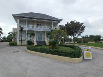 Visitors to The Bahamas mostly come for its great beaches, snorkeling, shopping and of course, the weather. However, there is also a deeper side to these islands and that ongoing story is being told at the National Art Gallery of the Bahamas in Nassau. (See our profile of the NAGB)
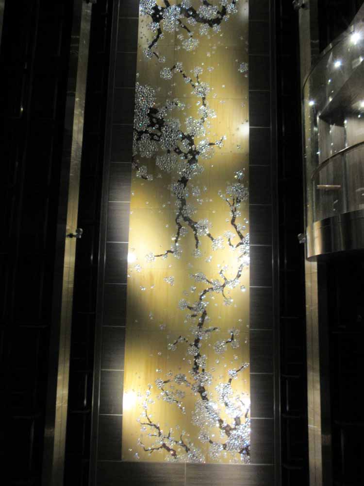
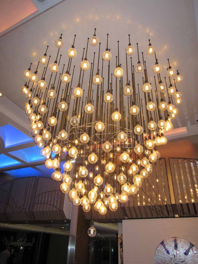
The mission of the National Art Gallery is to develop, collect, and promote a national collection of art for the benefit of Bahamians and the international audience. The easy course for a museum with such a mandate to have taken would have been to view it as a license to go out and collect art from all over the world which would then serve as a general educational tool just as a library purchases books from all over the world. Instead, the museum has chosen to develop and showcase Bahamian art. In doing this, the museum has placed itself in the midst of the conversation about what it means to be Bahamian. Topics such as colonialism, independence, tourism, religion, race, class and immigration are among the many topics dealt with by Bahamian artists. The museum does not impose its own views on these topics but rather lets the artists speak. To illustrate, one form of art that developed before independence in 1973 is picturesque scenes of the islands' natural beauty and scenes of everyday life. Some in the Bahamian art community criticize such works as presenting a superficial view of the islands and catering to "neo-colonial" exploitation of the Bahamas by the tourist industry. However, this uniquely Bahamian art can be viewed as analogous to the American Hudson River School, which showcased to the world the beauty of the young United States without going into the social and political issues then-facing the young nation. Just as the Hudson River works are recognized as valid and important art so too the Bahamanian picturesque. The National Art Gallery provides a forum for such conversations. This does not mean that only Bahamians will be interested in the National Art Gallery. By the end of my visit to the museum, I felt that I knew much more about the complexity of the Bahamian people and the issues they face. This added dimension to my visit to these islands. Furthermore, the works were visually appealing. Because the museum is interested in the full span of Bahamian art, it does not specialize in one particular movement or style of art. During my visit, I saw works that were traditional European style landscapes, contemporary realism, abstract art, folk art, sculpture, conceptual art and works that combined elements of African, European and Caribbean influences. One element that recurred throughout the exhibitions I saw was strong use of color. Perhaps this is a result of the light in the Bahamas, perhaps it is emotion, perhaps it is tradition, perhaps it is a desire to speak boldly but it does seem to be a unifying element. I particularly liked the strong use of color in Ricardo Knowles' “Turtle Cliff”, Dorman Stubbs' “Flamingos” and Lynn Pavoritti's “Mangrovia.” The National Art Gallery of the Bahamas is not a store-front operation but rather a first class facility. It is housed in the historic Villa Doyle. Located just down the street from Government House, Villa Doyle was built as a mansion by Sir William Doyle in the 1860s and served as the home of the first Chief Justice of the Bahamas. It was enlarged by Sir Arthur Moore in the 1920s, becoming one of the premier residences of Nassau. After the colonial era ended, it fell into disrepair. However, in a seven year restoration project, it was transformed into an art museum while preserving the exterior architecture. It was a pleasure to stroll around the landscaped grounds and observe the building. It is particularly commendable for the government and people of the Bahamas to have made such a commitment to art. Few other nations in the greater Caribbean have made such an investment. However, not only does the NAGB provide a vehicle for cultural self-examination by Bahamians but it also lets visitors see that this is a multi-faceted country with great creativity. 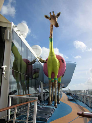 Royal Caribbean's Anthem of the Seas has a sophisticated contemporary décor. In fact, it is often said that the ship's decor looks more like a ship from Royal's premium affiliate Celebrity Cruises than the Las Vegas style décor of some of Royal's earlier ships. Accordingly, the art collection on Anthem is less aimed at eliciting a “wow” and more aimed at contributing to the ship's upmarket atmosphere. Anthem's art collection was assembled in partnership with International Corporate Art. It includes some 3,000 works of art. Almost all are contemporary works. The theme of the collection is “What Makes Life Worth Living.” According to the booklet about the collection, this theme encompasses “people, leisure, fashion, art &literature, food, adventure, entertainment & nature.” This scope is perhaps too broad as it is difficult to discern the theme just by walking around the ship and viewing the various works. However, knowing the theme is not vital to enjoying the art. Several large installations are included in the collection. At the center of ship's public areas is a grand chandelier created by Rafael Lorenzo Hemmer called “Pulse Signal.” It consists of some 200 light bulbs suspended from cords and arranged into a pleasing contemporary shape. The lights blink on and off in various arrangements thus changing the shape of the piece and the atmosphere of the area. It is a visually interesting piece. Guests can control the blinking of the lights by putting their hands on a pad that is located beneath the chandelier. The blinking is then synchronized with the guest's pulse. This does allow for viewer involvement with the art but I find it somewhat gimmicky and unnecessary. Just aft of the chandelier, ascending up the atrium is the prettiest piece in the collection, Ran Hwang's “Healing Garden.” Dark tree branches with bright blossoms are set against a gold background. The work recalls traditional East Asian cherry tree paintings. However, the artist has included non-traditional materials such as crystals, buttons and pins, which give the work a glamorous look. Going further aft, you come to a monumental sculpture by Richard Hudson. It is a swurling mass of highly polished metal. Although entitled “Eve”, it has become widely known as “The Tuba” because of its twisted horn-like shape. Despite this unfortunate nickname, it is an important piece consistent with the upscale shops, the cosmoploitan wine bar and the specialty restaurant that surround the plaza in which it is the centerpiece. You can find works that contribute to Anthem's sophisticated atmosphere throughout the public areas and on the staircases. However, there is also whimsy in the collection. For example, in each of the elevators there is a giant image of an animal. Deming Harriman has manipualted these images so that the various animals are wearing items of human clothing. By adding these items, the artist gives the animals human personalities, making the images both amusing and a commentary on human foilbles. Atop the ship is a larger than life sculpture of a giraffe wearing a swimming costume and an inner tube. Known as “Gigi” this lovable character by Jean Francois Fourtou marks the ship's amusement park area. There is also art along the corridors leading to the passenger cabins. These include contemporary photos staged so as to look like advertisements or scenes from 1950s America. There are also posters with inspirational slogans like the ones that the youth culture used to decorate college dormitories in the 1960s. Overall, the Anthem collection is successful. The theme is perhaps too broad to present a coherent message. However, the pieces are visually pleasing and often thought provoking, Also together, they serve to support the overall atmosphere of the ship. 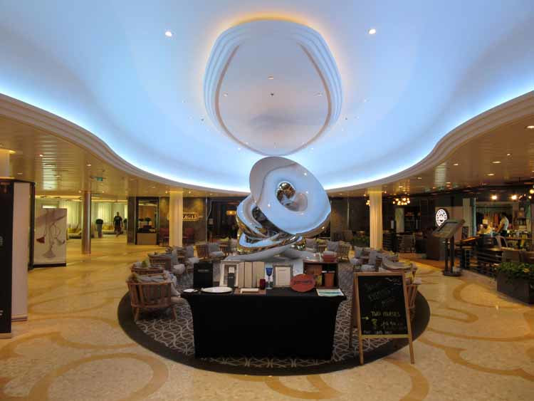 Above: Richard Hudson's Eve provides a centerpiece for one of the ship's plazas. Below left: Ran Hwang's “Healing Garden” in the ship's atrium. Below right: "Pulse Signal" by Rafael Lorenzo Hemmer is in the center of Atrium's public area.
 “David Hockney” is a retrospective exhibit of the works of David Hockney. It has previously been at the Tate Britain in London and the Pompidou Center in Paris. We saw it at New York's Metropolitan Museum of Art.
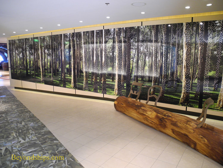
Britain's best known living artist, David Hockney was born in Yorkshire in England in 1937. After studying art in Bradford, he moved to London in 1959 to study at the Royal College of Art where he achieved a reputation as a superstar. A trip to Southern California in 1964 resulted in a lifelong fascination with California where he has lived on and off for 50 years. Now 80, Hockney continues to produce art each day. The exhibition presents 60 canvases, 21 portrait drawings and a number of other examples of his work arranged in eight galleries. They are grouped roughly in chronologist order. A retrospective exhibition allows the viewer to survey the artist's body of work and learn something about the artist that you cannot learn by just viewing an individual work. For example, although Hockney achieved success at an early age, he did not just stick with that winning formula. Rather, the exhibition shows a willingness to experiment with different ideas. But this does not mean that he abandoned everything when he moved from one idea to another. To illustrate, Hockney's early work was abstract. Abstraction was the style that the art establishment endorsed in the early 1960s and so it is not surprising that a young artist of that era would do that type of work. On the surface, Hockney would seem to have abandoned abstraction in favor of a more figurative style when he progressed to his California swimming pool works (probably his most famous works). But, his use of geometric shapes (i.e. rectangles) in those pictures recalls Modernist thinking. Still later, his landscapes have the flavor of artists such as Picasso and Matisse, not only in the choice of colors but in the use of shapes. We also see Hockney's predominant form of work move from abstraction to realistic genre scenes, to portraits to landscapes. With regard to portraits, the exhibit presents both examples of his famous double portraits and examples of portrait drawings. The double portraits are on a monumental scale and the figures seem to be isolated with invisible defensive walls separating them from each other. The portrait drawings are smaller and more revealing of the sitters' personalities. The walls are down. Yet another characteristic that comes through in the exhibit is Hockney's willingness to experiment with different media. He is best known as a painter, first using oils but then becoming one of the foremost users of acrylics. However, he has also experimented with watercolor, etchings, photography, photocopiers, fax machines and more recently digital art. In fact, the exhibit has three examples of works that he did on iPads. This week, we take a look at the art collection on the cruise ship Celebrity Reflection. Celebrity Cruises has been collecting art and displaying art on its ships since its founding. Credit for beginning the Celebrity Art Collection in the 1990s is usually give to Christina Chandris, wife of John Chrandis then the owner of Celebrity Cruises. The line has since been purchased by Royal Caribbean Cruises Ltd. but the tradition of having an art collection aboard the ships continues. Responsibility for assembling the art collection on Celebrity Reflection, which entered service in 2012, was given to a firm called International Corporate Art. As when Ms. Chandris began the collection, the works on Celebrity Reflection are contemporary. They are primarily conceptual with much use of photographic images and non-traditional materials. There is almost no use of traditional techniques such as drawing or painting. The collection is prominently displayed. Indeed, there are several large installations that occupy considerable space. The works on the forward and aft stair towers are beautifully lit and dominate the landings. Clearly, the art collection was not an after thought. Since the name of the ship is Reflection, the theme of the collection is “the seductiveness of reflection.” The term “reflection” is meant both in the literal sense of surfaces that reflect light and in the metaphysical sense of thinking (reflecting) on a topic. If you look for this theme in the works, you can find it but it is not really vital to appreciating these works. Next to each work is a plaque discussing the work. These tend to be somewhat enthusiastic, using strings of adjectives and phrases which meld together to become rather meaningless. They obscure rather than clarify but that is often the case with the art establishment. Good art does not require verbose explanations. Each of Celebrity's Solstice class ships has a living tree suspended in the central atrium. On Reflection, this centerpiece was designed by Bert Rodriguez. The tree grows upward out of a shiny metallic basin. On the bottom of the basin is an aluminum tree pointing downwards. In other words, the aluminum tree is like a reelection of the living tree. However, unlike the living tree, the man-made tree is without leaves, only colorless electric lights adorn its branches. Another major installation is located by the specialty restaurants. On either side of the corridor are large photographic images from a forest. However, each of the trees has been perforated with reflective materials in each of the holes. Thus, you can glimpse your image moving through the forest as you pass by. It is visually impressive. The artist was Albano Afonso. Not far away is another installation, the Celestial Garden by Carlos Betancourt in collaboration with Alberto Latorre.. Colorful flowers contrast cover the walls, ceiling and floor, set against dark, nearly black backgrounds. Quite pretty. A shiny, abstract-shaped bench provides the reflective element. Of the works in the stairtowers, I found the photographic images by Miranda Lictenstein the most appealing. She manipulates the images so that they become essentially unrecognizable forming abstract designs. Her choice of pastel, natural colors in these images, however, makes them attractive. I was also impressed by the life-size silhouette at the top of this same tower, a photographic image by Yuki Onodera. The sparkling lights on the woman's dress are actually fragments of other photographic images. I did not find everything in the Celebrity Reflection collection appealing. However, I did find the collection thought provoking. I could not dismiss any of the works out of hand. Rather, I had to think about why I did not like a particular work. Causing viewers to think is a hallmark of a good collection.
Above left: "Untitled #2", "Untitled #4" and Untitled #7" by Miranda Lichtenstein in the aft stair tower.
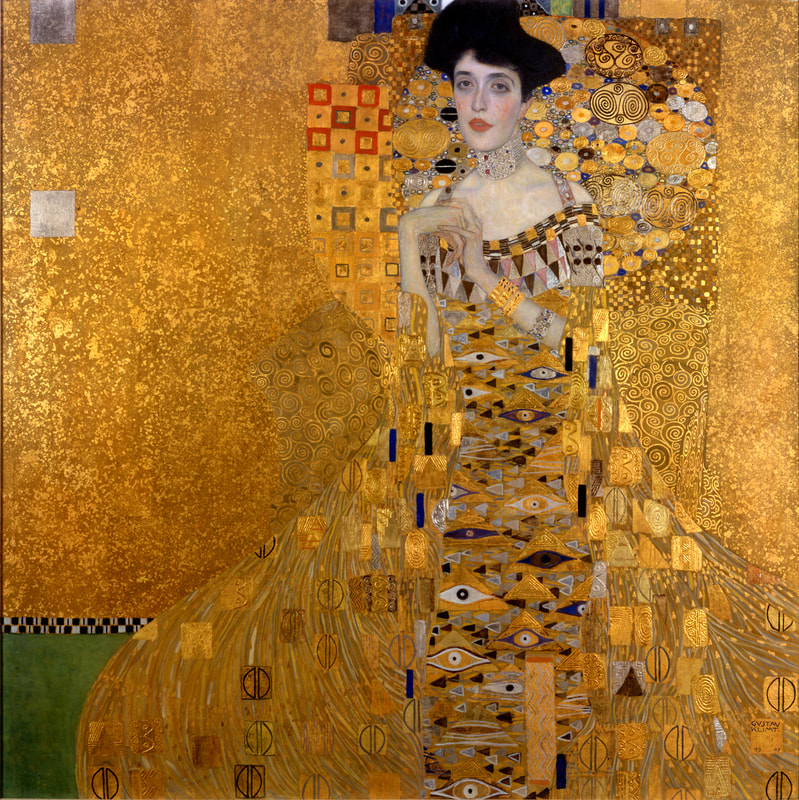
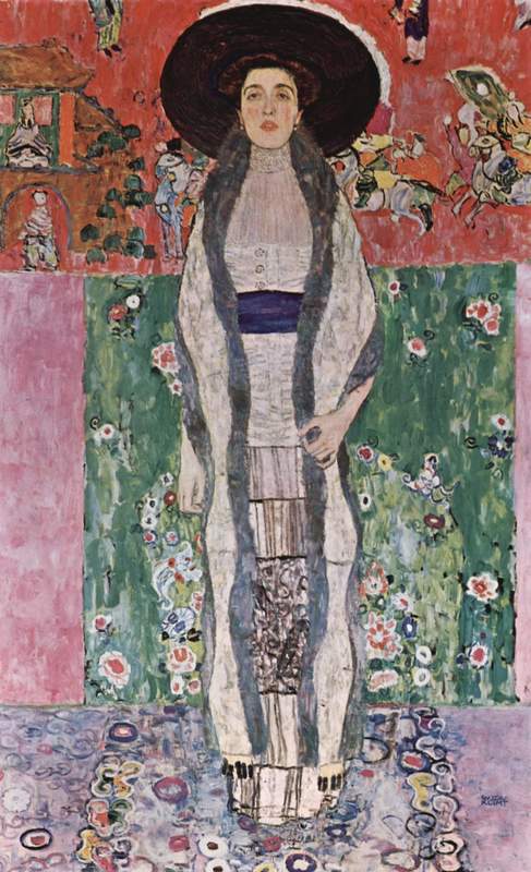
Above right: An installation by Albano Afonso. The centerpiece of the Neue Galerie is the Klimt Gallery on the second floor. This room is home to ten or so works by Gustav Klimt. While there are many interesting works in the Neue Galerie, this is where you find the most visitors. Undoubtedly, Klimt is the best known of the Austrian and German artists featured in this museum. But what makes his art successful? Klimt was born in 1862 outside of Vienna. His father was an engraver often working with gold but Gustav grew up in poverty. He received his artistic training at the State School of Arts and Crafts as did his brother Ernst. The teo brothers formed a partnership with fellow artists Franz Matsch and found their first success doing conventional history paintings. Gustav was not satisfied with conventional art. Therefore, after Ernst's death, Gustav became a founding member of the Vienna Secession, a group who sought to break away from the rules of the art establishment of the day. Nonetheless, his unconventional style was appreciated by Vienna's growing middle class who commissioned him to do portraits. On the surface, Klimt's private life might appear to have been conventional. All his life, he lived in an apartment with his mother and two sisters. After Ernst died, he became the guardian for his niece. He never married. But when you look a little deeper, you find that surface appearances can be deceptive. When Gustav died in 1918, the court handling his estate received 14 petitions for child support. The court concluded that three of these were proven. Such claims were consistent with the widespread rumors that Gustav had had numerous affairs with his models as well as with some of the rich ladies whose portraits he had painted. In the studio, he dressed only in a loose robe and there were tales of models cavorting between posing for erotic drawings. Thus, Klimt was both an artistic rebel and a very sensuous individual. These are also the hallmarks of Klimt's best works. The superstar painting of the Klimt Gallery is “Adele Bloch-Bauer I” This painting was the subject of the popular film “The Woman In Gold” but that is not the only reason people stop and linger in front of it. It is not a conventional portrait. Indeed, only the sitter's head, shoulders and hands are easily discernible. The golden gown that covers the rest of her body blends into the background. It is a two dimensional picture full of decorative designs and geometric patterns. Yet, the various elements of the picture come together to support the face, which dominates the sea of gold. The face is not classically beautiful but it is attractive. Her eyes are soulful and her red lips sexual. It was believed at the time that Adele was one of the women with whom Gustav had an affair. His painting “Judith,” which Adele also posed for, certainly suggests that their relationship was more than platonic. Returning to the portrait, this face surrounded by sumptuous gold leaf makes the work very sensuous. Also in the Klimt Gallery is “Adele Bloch-Bauer II,” a slightly later portrait of the same person. It does not have the gold work of the earlier portrait and thus is not as bold. The figure is more conservatively dressed in what was probably a daytime outfit and stands out more than in the predecessor painting. Still, it is an unconventional portrait, Once again it is two dimensional. Colorful rectangles decorated with Japanese-inspired designs make up the background. The figure is not posed provocatively but rather she is straight as a pillar. Nonetheless, her sensuality comes through in her face through Klimt's handling of the eyes and the lips. She is portrayed intriguingly but with a touch of innocence. On the same wall is “The Dancer,” which is similar in dimensions and in composition to “Adele Bloch-Bauer II”. It is perhaps more colorful and more flesh is more exposed but it works for generally the same reasons. Most of the other pictures in the Gallery are landscapes. They recall works done by the Impressionists and the Post Impressionists and would have been unconventional at the time they were painted. However,without the human figure there is little sensuality and therefore less interest.
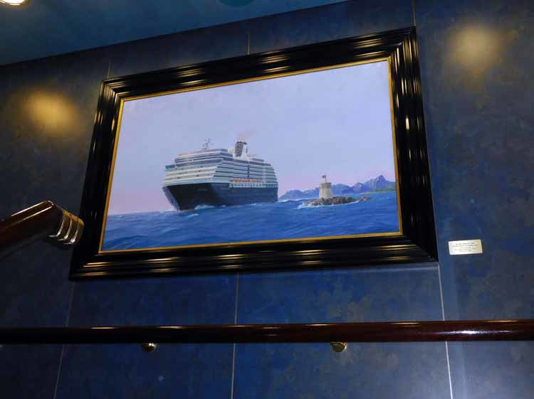
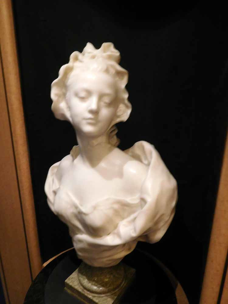
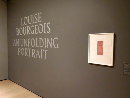 Louise Bourgeois is best known for her giant sculptures of spiders. However, as seen in “Louise Bourgeois: An Unfolding Portrait” at New York's Museum of Modern Art, there was more to Bourgeois' work than spiders. Bourgeois was born in 1911 in Paris, France. Her family operated a gallery that sold tapestries where they all worked. The father concentrated on the commercial aspects of the business while her mother, with Louise's assistance, worked on restoring the tapestries. It was not a happy family. Her father was a philanderer and abused Louise. Her mother ignored her father's infidelities and focused on providing a nurturing environment for her children. The emotions Louise experienced then were to influenced her art throughout her career. Indeed, her spider sculptures were a tribute to her mother reflecting qualities of reliability, protection and industriousness. After her mother's death, Bourgeois began to study art in 1930s Paris. She also came into contact with many of the artists working in Paris at that time including the Surrealists. To help generate some income, she opened a print shop next to the family tapestry gallery. There she met American art historian Robert Goldwater. They were married in 1938 and moved to New York City. In America, Bourgeois studied at the Art Students League of New York. During this period, the League was an artistic epicenter where important artists and artists who would soon become important congregated both as teachers and students. Through the League and her husband's contacts, she came into contact with people such as Jackson Pollock, Mark Rothko, and Willem de Kooning. At the same time, Bourgeois' work was becoming recognized. By 1982, she was so established that she had her first retrospective exhibit at MOMA, the first woman artist to have such an exhibition. She continued to produce art until her death in 2010. Bourgeois used her art to explore her emotions, sexuality and as a means of resolving conflicts. Thus, one can see her returning to certain topics repeatedly in her work. The exhibit has been arranged around a number of themes. For example, one theme is architecture. Bourgeois liked the stability and order of buildings - - a stark contrast to the dysfunctional environment in which she grew up. Another theme is fabric, works made from cloth. Again, this echoes back to her early days in the tapestry gallery. Although there are some sculptures in the exhibit, most of the 300 works are prints and drawings. The prints are particularly instructive. In making a print, Bourgeois would first make an image on a plate. After seeing a print the plate, she would make changes to the plate and print again. This process of printing the plate and then making changes would continue until she had the final image that she wanted to publish. Since the interim prints were saved, you can see how her thinking evolved. In addition, there is significant variety within the various series. For example, some of the prints have both black and white and color versions. The viewer can decide for himself or herself which version of the image speaks best. It is not necessarily the version selected as the final one by the artist. 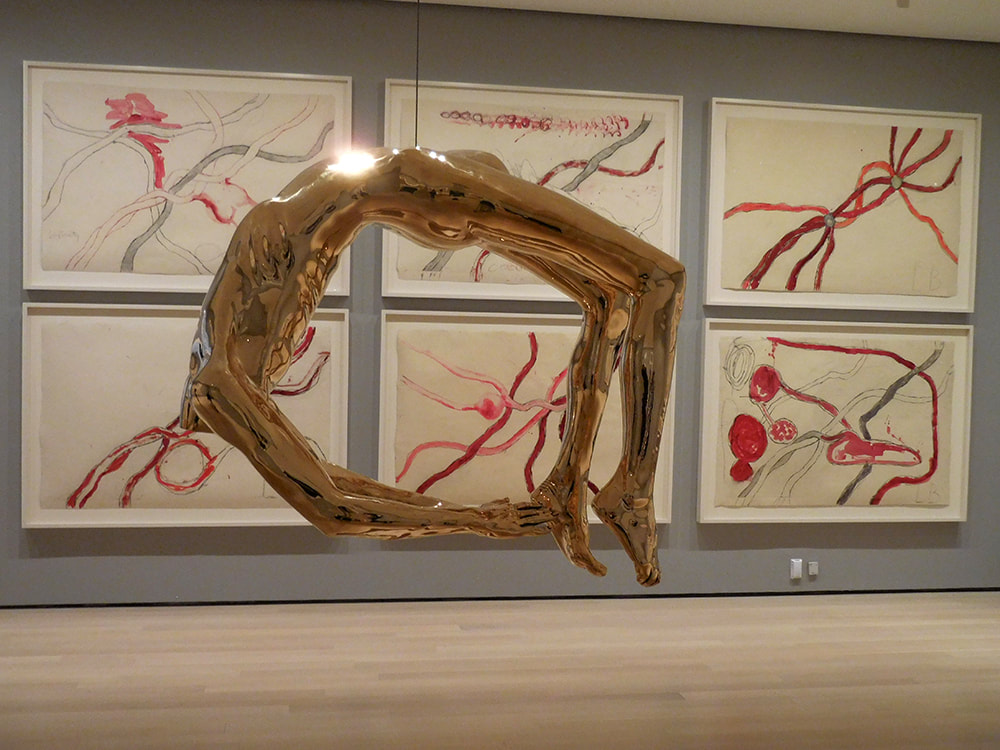 Holland America Line is one of the cruise lines known for investing in art for its ships. The line attracts well-educated passengers who appreciate culture and a sophisticated atmosphere. Consistent with this, the Holland America ships feature museum quality art collections. The art is not presented as in a museum or a gallery. Although there are plaques next to each work giving information about the artists and the work, the works mix in with the overall décor of the ships' public areas. Recently, I sailed on Holland America's Oosterdam. As discussed below, that ship's collection can be divided into three categories. First, the ship has quite a few works by contemporary artists. Chief among these is a series of maritime paintings by Stephen Card. On each landing of the ship's forward staircase is a large oil on canvas depicting ships that have sailed for Holland America line. The style is traditional and understated. Although accurate, these are not mechanical drawings but rather scenes of the ships in various locations under various weather conditions. They evoke the spirit of the sea and invite the viewer to enter into the scene. Card is clearly the leading contemporary maritime painter. Holland America has an arrangement under which musicians are supplied to Holland America's ships by the late BB King's organization. Just outside where the BB King All-Stars play on Oosterdam are a series of sketches by Wil van der Laan depicting Mr. King and other musicians. The style here is free and loose capturing visually the energy of the musical performances. The second category in the Oosterdam's collection are contemporary works inspired by or done in styles of the past. For example on the landings of the midships stairway are a series of large medallions by Lebigre & Roger that are essentially enlargements of coins issued by the Dutch East India Company between 1600 and 1800. The same artists also created a set of traditional bronze Commedia dell' Arte figures, which are also in Oosterdam's collection. Each of the Holland America ships has a large maritime painting done in traditional Dutch style. On Oosterdam, this monumental work is an oil on aluminum called “Maritime Relations” by Cees Muller. It depicts a Baroque era city with numerous sailing ships in the waters surrounding the city. The final category of works is antiques. Most of these works are European sculptures. Although by lesser known (or unknown) artists, these works are of good quality and help to create a more refined atmosphere aboard the ship. I particularly liked the charming small marble bust of a woman by Henri Weigele from 19th century France.
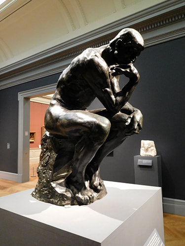 Rodin At The Met is a salute to the sculptor Auguste Rodin on the 100th anniversary of his death. It is an entirely fitting tribute as the then-young museum was a supporter of this artist during his lifetime to the extent of opening a gallery dedicated to his work in 1912. Rodin showed his appreciation by giving the Met additional works. This exhibit of some 50 works includes not only the works that the Metropolitan Museum of Art acquired during the artist's lifetime but also works that it has collected subsequently.
Auguste Rodin was from a working class family that lived in Paris. He received his basic training in art at the Petit Ecole. However, he was refused admission to the prestigious Ecole des Beaux-Arts, the leading art academy in France. Although this forced Rodin onto a much more difficult road to success, he also avoided indoctrination into the lifeless Neo-classical style that was the trademark of that school. Instead, Rodin slowly built his own style along with his reputation, first as an apprentice to other artists and then on his own. One turning point was his visit to Italy in 1876 during which he was very impressed by the sculptures of Michelangelo. Even after he achieved fame, Rodin's style was not what people expected. There is story after story of how individuals and public authorities commissioned works only to be shocked by Rodin's final product. Those that were rejected are now recognized as some of the greatest works of 19th century art. Rodin found fame in the United States after some of his works were displayed at the 1893 Chicago World's Fair. Here again, some of his works were found so shocking that they were exhibited behind a curtain in an area that required special permission to enter. However, private collectors and museums were soon purchasing his works. The Met has casts of several of Rodin's best known pieces including The Thinker, the companion sculptures Adam and Eve, the Age of Bronze and a study for the Monument to Balzac. Rodin modeled his sculptures in clay. Plaster casts were then made to preserve the sculpture. From these, bronze casts were made or marble carved often by studio assistants. This explains why the same work can appear in multiple museums. There is a discernible difference between Rodin's bronzes and marbles. You can see the power of the sculptor's fingers working the underlying clay in the bronzes. The marbles tend to be less distinct, smoother and gauzier, almost dream-like. In either case, you can clearly see Rodin's works were a clear break from the allegorical figures and gods and goddess so popular at the time. While some have titles that relate back to mythology or the bible, these works are of real people with real emotion. A particularly fascinating part of this exhibit is Rodin's works on paper. In addition to sculpture, Rodin also did watercolors and drawings. Some of these were in preparation for sculptures but mostly they were another means of communication. It is said that Rodin would draw without removing the pen from the paper and without taking his eyes off the model. The results were images that border on abstraction and which are full of emotion. Along with Rodin's works, the Met has hung examples of works done by his friends. One such friend was Claude Monet who also was leading a revolution in art in 19th century France. The two artists held a joint exhibition in 1889. These contemporary works help to place Rodin's works in context |
AuthorRich Wagner is a writer, photographer and artist. Archives
November 2018
Categories
All
|
 RSS Feed