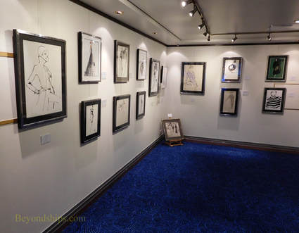
 It is not unusual to find an art exhibition on a passenger ship. Most cruise ships have an art gallery that sells prints and original works of art. What is unusual is for a ship to host a preview of an art exhibit that will be seen on land in a major city. As part of its 2017 Transatlantic Fashion week, the ocean liner Queen Mary 2 held a preview of “Drawing On Style: Original Fashion Illustration.” This exhibition was a preview of a larger exhibition held at the Gray MCA Cheryl Hazon Gallery in New York City. The preview presented 21 works by 10 artists. It was held in the annex to QM2's permanent art gallery. Until fairly recently, illustration was a somewhat disparaged stepchild of fine art. In part, this was due to the fact that illustration has commercial connections. It is often used in advertising to sell a product or service. Also, illustration was often used in conjunction with a book or a story to elaborate on an idea or a point made by the author of the book or story. In such situations, it was argued that the illustration is subservient to the book or story and not a stand alone artistic concept. The old view of illustration lost ground as people came to realize that a good illustration can stand on its own without regard to the product or story it was commissioned to serve. Indeed, at this exhibit, it is hard to detect what fashion designer's conept the works were originally intended to illustrate. It s only by reading the signage that you find that a given work was done for one of the great fashion houses or a well-known fashion magazine. In other words, the works stand on their own. The works on display were drawings, often pen and ink with a brushed wash but also some graphite works and some watercolors. They were not traditional drawings. Rather, like the Mask paintings of Henri Matisse, they distill the subject matter to its essential lines. Colin McDowell, fashion commentator and one of the artists whose works were included in the exhibit, explained: “In fashion illustration, you are creating a mood, a feeling and you can do it in very few lines. Elimination, just get the essence.” In his remarks opening the exhibit, Mr. McDowell pointed out that fashion illustration reahed its zenith with the fashion magazines of the 1930s and 40s, which were aimmed primarily at upper class ladies. As the demographics of their readership changed in the 1950s, the publishers began to favor photographs over illustration in order to appeal to a younger and broader audience. By the end of the century, photographs had all but replaced illustration in the fashion magazines. The exhibit chronicles this period with examples of works from throughout this period. It includes several works by Kenneth Paul Black, who Mr. McDowell called “the last of the great fashion illustrators.” However, I was most attracted to the works of contemporary British artist Jason Brooks because of the emotion he conveys in a minimum of lines. It was an exhibit rich in fashion history. But the pictures were not just of interest for their historical value. They were good pictures.  “Poussin, Claude and French Drawing in the Classical Age,” an exhibition at the Morgan Library and Museum in New York, looks at the role of drawing during one of the peak periods in French culture. Although France had long been a powerful European nation, it rose to new heights in the 17th century during the reigns of Louis XIII and Louis XIV. In essence, it became the leading power in Europe politically and militarily. At the same time, the arts flourished under the patronage of the French royal court and the ducal court of Lorraine, then an independent nation but later to become part of France. During this time, French artists often traveled to Rome to study both the work of the ancients asforma well as the Italian Renaissance masters. When they returned to France, they brought with them new ideas that stimulated the native talent. As a result, Paris became a center for artistic activity. Drawings served three purposes. First, artists often made drawings to capture scenes that they encountered. Afterall, they did not have iPhones. Second, drawing were used to make studies in preparation for paintings and other more complex works. Third, drawings were done as completed works. This was often the case with portrrait drawings, which members of the court collected and placed into albums. Two of the most important French artists of this period were Nicolas Poussin and Claude Gelleee – better known as Claude Lorrain. Poussin was from France but first achieved success in Rome. In fact, he only returned to France because he was summoned home by the King and then he only remained there for two years. Poussin was very interested in classical antiquity and his work often focused on classical mythology, history and biblical scenes. His drawings were done in preparation for his paintings. The drawings in the exhibit show that he felt free to use a looser style that at time borders on the abstract in his drawings rather than the more precise style of his paintings. Claude Lorrain also studied in Rome and also eventually returned to settle in that city. Lorrain was interested in nature as a manifestation of the divine. He would do sketches directly from nature but he would alsoDaniel rearrange features in his finished landscapes to accord with idealized principles. I found his more free flowing sketch style more appealing than his more formal finished style. Poussin and Lorrain are not the only artists represented in this exhibit. We see that other artists were heavily influenced by classicism while at the same time other artists were developing naturalism. In the former area, the style is too cold and impersonal for me. In the latter group, Simon Vouet's Study of a Woman Seated on a Step has an informality that appeals to modern tastes. However, the presence of a study of hand on the same piece of paper reveals that it was only meant as a preparatory piece. Perhaps the most appealing of the drawings in the exhibition are the portraits. Vout's portrait of his patron Louis XIII presents the sitter as an affable human being rather than a remote monarch. In contrast, Daniel Dumononstier's Portriat of A Gentleman of the French Court is technically excellent but the sitter comes across as quite cold. One thing that surpised me was the color of the drawings. Inasmuch as the works are nearly four centuries old, one might well expect yellowed paper and faded ink. However, quite a few of the works were done on light brown paper and used brown ink. Thus, they probably looked much the same four centuries ago as they do today. The exhibition includes more than 50 drawings. Most of these are from the Morgan's own collection but they have been supplemented with works from the Metropolitan Museum of Art and from private collections. The placards next to the various pieces are excellent. In addition, there is a complimentary booklet discussing the works. I feel this is particularly important because for the general public, this is not a particularly familiar period of French art and the information provided by the Morgan explains its significance. This makes it a more enjoyable as well as educational experience. 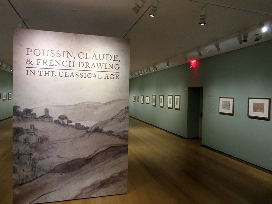 “Eighteenth Century Pastel Portraits” at the Metropolitan Museum of Art is a small exhibit of European pastels. It includes, French, Italian, German and British works from the museum's collection. An exhibition of pastels is not all that common. Works done in pastel are light sensitive. Prolonged exposure to light causes some pigments to fade. In addition, most pastels are done on paper and paper can fade or deteriorate with prolonged exposure to light. As a result, museums generally exhibit pastels in rooms with dim light and even then only for brief periods. The difficulties associated with such arrangements prevent museums from mounting pastel exhibitions very often. Essentially, a pastel is made up of pigment and a binder such as gum. The combination is then molded into a rounded or squared stick. The artist can then use the sticks in the same manner as a pencil. In other words, he or she can create a work without using brushes or mediums such as oils. Historically, pastels were often referred to as crayons. However, pastels differ from modern crayons in that the binder in crayons is usually wax. Pastels are more powdery than modern crayons. While crayons stick to paper better than pastels, pastels are easier to blend and they cover the ground more easily than crayons. Another somewhat confusing term that you often see is “pastel painting.” A pastel painting merely means that the pastels cover the entire ground. A pastel that leaves part of the paper exposed is a “pastel sketch.” It is believed that pastels were invented in the 15th century. There is evidence that Leonardo Da Vinci knew of pastels from a French artist in 1499. In any event, pastel portraits became very popular in Europe during the 18th century. People were attracted by the luminosity of the pastels and the speed and ease with which they could be used. The exhibit presents works by several of the leading pastelists of that era. Rosalba Carriera specalized in pastel portraits and became one of the most successful women artists of all time. She began by painting miniatures but by 1703, she had mastered pastels. Not long after, merchants, nobles and visitors to Venice were queuing for her pastel portraits. She went to Paris and painted the king and his nobles. She went to Vienna and the Holy Roman Emperor became her patron. Carriera is represented by a portrait of a young Irishman dressed in a cloak and tricorne hat. The mask that he has shifted away from his face shows that he is in Venice for the Carnival. Proud and dashing, it is the image of a young noble living life to the full in that romantic city. John Russell was the leading English pastel portraitist. In fact, he was appointed pastel artists to King George III. He also wrote the still inflential book Elements of Painting with Crayons. Russell is represented by three works. One is a charming portrait of his daughter with a baby. The other two are commission portraits of a merchant and his wife. She looks like the dominate one of the couple while he seems to have the look of someone who knows when he is well off. The signs by the paintings tell us that she was an heiress and that when the couple married, he took her family name. Adelaide Labille-Guiard was a member of the French royal academy of painting and sculpture. She is represented by a portrait of Elisabeth de France, the younger sister of King Louis XVI. A virtuous and religious person, there have been calls for pleasant looking person's beatification. However, there is always an element of tragedy in pictures of the members of this doomed family. The images in this exhibit are in sharp contrast to the familiar pastels of artists such as Degas. Rather than strong expressive lines, these works are soft and smooth with no trace of the artists' strokes. Still, they subtlety convey the personalities of the sitters.
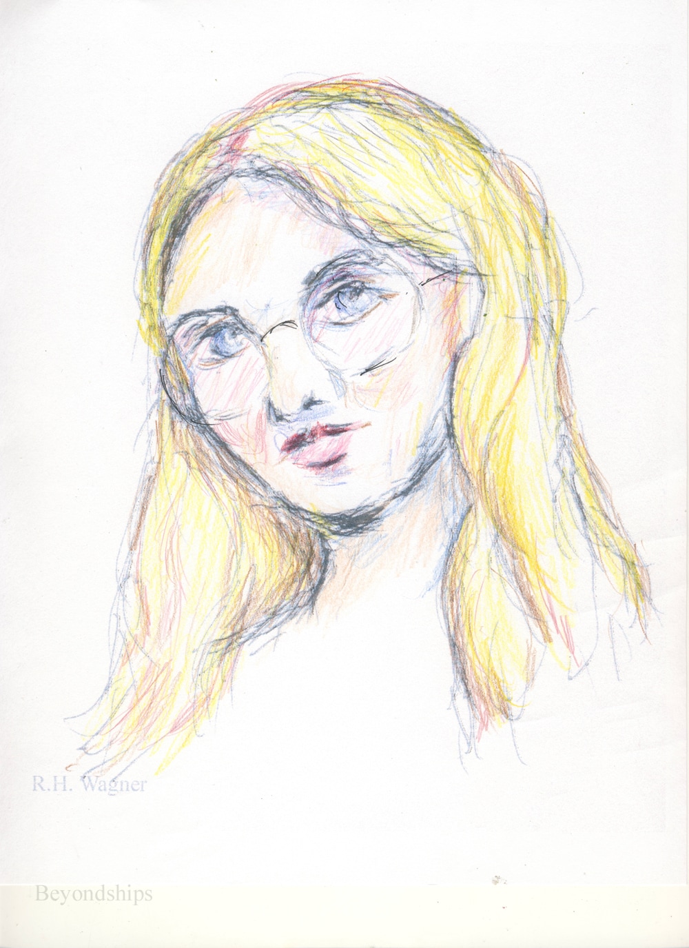
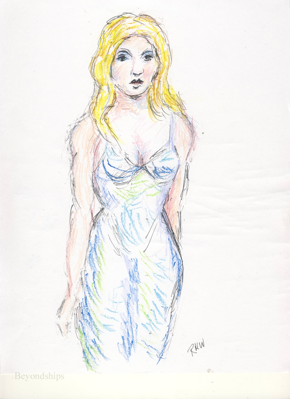
As I have mentioned before, I often do sketches while I am commuting on a train or when I am sitting waiting for something such as a doctor's appointment. For the most part, these sketches are just for practice. However, from time to time, one is a special image that I would like to take further. The problem is that the sketches are small, pocket-size images done on a note pad or on a piece of scrap paper. Their size and the quality of the paper preclude trying to make them into a series piece of art. My solution has been the traditional one - - I hand copy the image onto a larger, better quality piece of paper. Once the image has been successfully transferred, I can add color, change it or otherwise develop the work. A problem with this method is that sometimes something gets lost in making the copy. An image can have a certain something that cannot be re-captured no matter how hard you try. A random line or two may be what gives the sketch its character. Also, hand copying can be a lot of work. This week, I tried an experiment. I took two small sketches and made high-quality digital images of them. Once you make a digital image of a work, there is a lot that you can do with it using a photo editing program such as Photoshop. You can add color, erase mistakes, improve the brightness and contrast etc. But I was not looking to digitally manipulate these sketches. Rather, my goal was to enlarge the image and then work on it by hand. Therefore, the next step was to print the images. Of course, the print will depend upon the quality of the printer. However, using my rather ancient printer, I was able to print out acceptable quality prints that could serve as the base for further development. I then used a pen to emphasize some of the lines. For color, I used colored pencils on one and Cray-pas on the other. I was pleased with the results. The size of the works was now more substantial. Also, the addition of color had enhanced the images. Clearly, there are limitations to this process. The largest paper my printer will accept is A4 so the image cannot be larger than one that would fit on that size paper. Along the same lines, he printer is probably not capable of handling heavy water color paper and the like. A better printer would push these limits out further. I don't think I will give up on hand copying. However, this little experiment has put another arrow in my quiver.
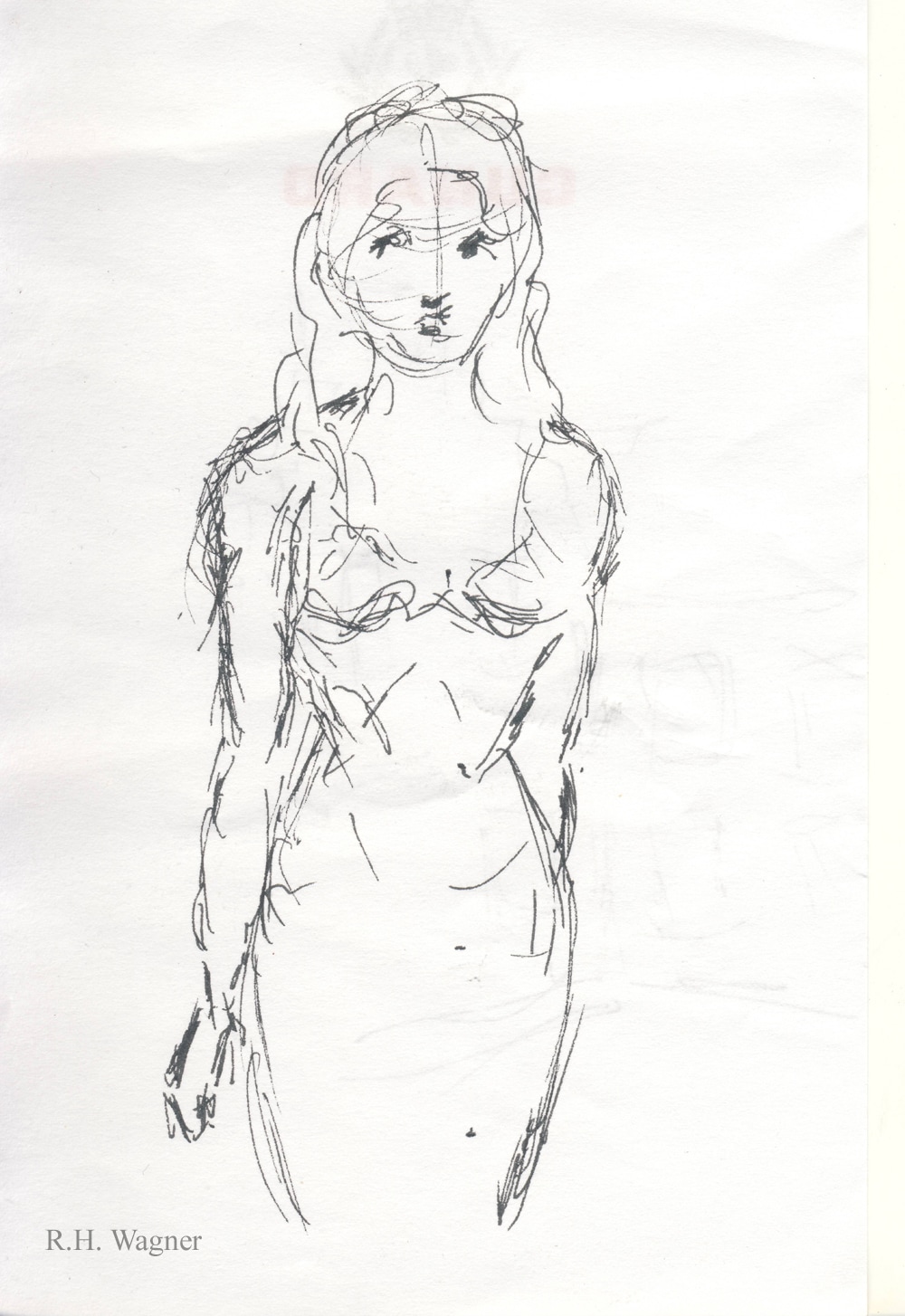
Before and after. On the left side are the original images, both done on 3 x 5 inch note paper. On the right, are the images after scanning, printing and further development by hand. They are now on *.5 by 11 inch paper.
 A smart phone image of a work in progress. A smart phone image of a work in progress. I find that the more I work on a picture, the less I am able to see it. No, I don't mean that my eyes become blurry. Rather, I mean that I am less able to see the picture objectively.
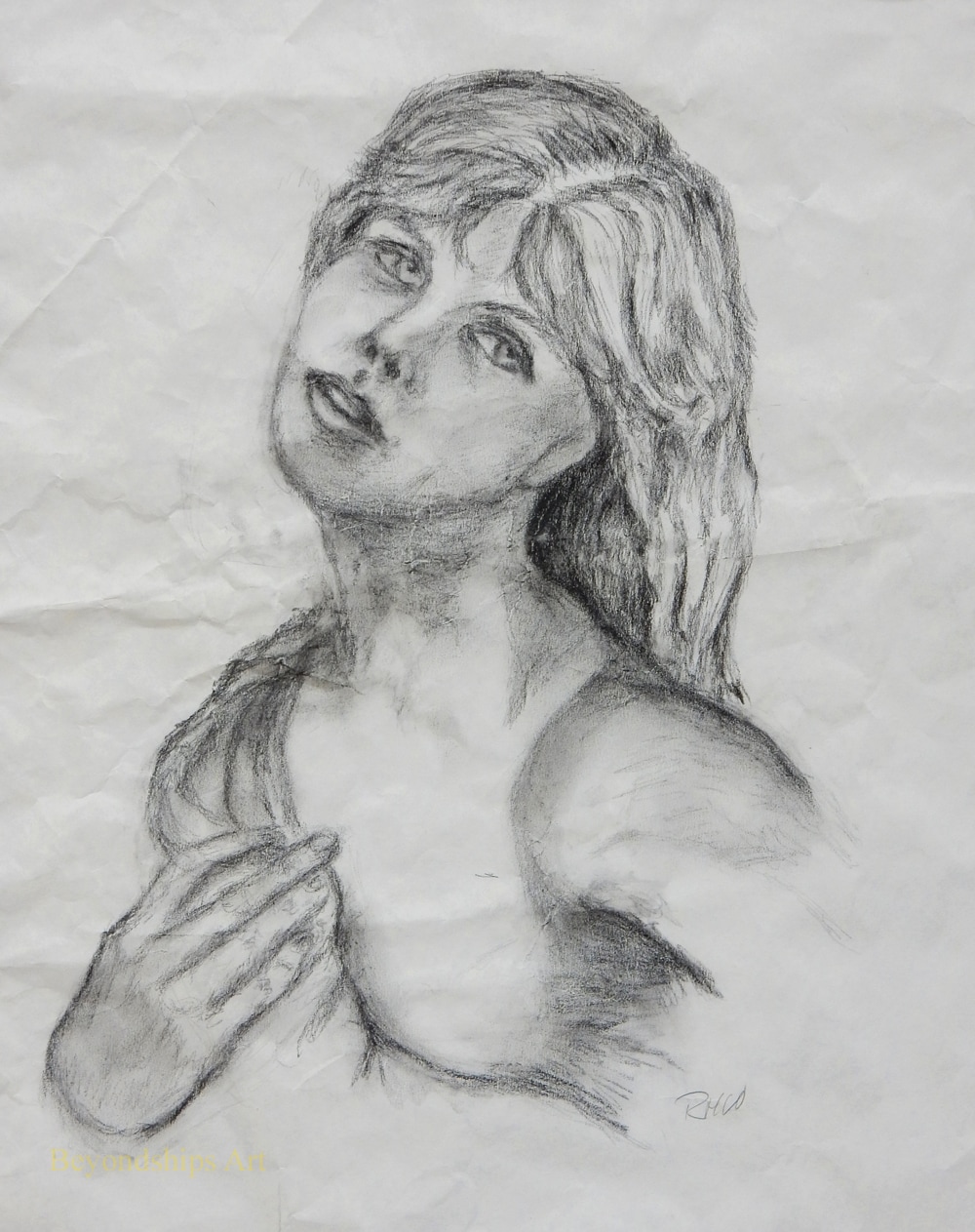
This can lead to three problems. First, I can't see the mistakes that I have made. The eyes in a portrait can be positioned at different levels making the subject the look like something from a horror movie. Yet, what I see is something that Leonardo Da Vinci would envy. Second, I go on working even though the picture is finished. A picture can easily be ruined by overworking it. Third, I go on working on a picture even though it will never be anything worthwhile. Some pictures are just failures. There is a tendency to think, if I just make a few more changes it will be a masterpiece. However, in reality, you're just wasting your time. Better to start something new. The inability to see a work objectively occurs because the mind has a tendency to see what it wants to see. Therefore, what is needed is a fresh view of the picture. My mother, the artist Valda, used to recommend holding the picture up to a mirror. This breaks the spell and in the mirror image,you can see the work much more objectively. A technique more suited to the digital age that I often use is to take a photo of the picture with the camera in my smart phone. The objective is not to get an image that you would want to share with friends and family but rather to look at your picture in a different way. My smart phone is well-suited to this task. It takes a serviceable image in almost any light. In addition, I can see the image immediately on the phone's display screen. I often end up taking several pictures as I work. Having used the smart hone to detect a problem, I endeavor to correct the problem on the original picture. Another photo tells me whether I really have solved the problem and whether there are other problems that need correcting. The only problem that I have found with this technique is that it can use up the storage on the smart phone. Therefore, it is best to delete the images as you go along. 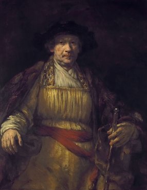 Rembrandt, Self Portrait (Image public domain Wikimedia Common) Rembrandt, Self Portrait (Image public domain Wikimedia Common) Portraiture isn't just about capturing a likeness. A good portrait communicates something about the person who is the subject matter of the work. I have always liked the work of the English portrait artist Sir Thomas Lawrence. Many of his subjects were famous people such as the Duke of Wellington but that is not what makes the works interesting. A look in the eyes, the smile, the position of the body reveal something about Lawrence's people even the ones who history has forgotten. You feel like you would have liked to have met them. Along the same lines, this is why most portraits done by sidewalk artists are disappointing. Many are great technically. However, in most cases, the artist is merely producing a likeness without seeking to know or understand the person who is the subject. Since portraiture can (and should) be a way of communicating something about the person who is the subject of the work, it can be a means of self-analysis. In order to say something about a subject, you need to understand how you feel about that subject. The classic example of self-analysis through portraiture is the self-portrait. A good self-portrait reveals how the artist sees himself or herself. Rembrandt did self-portraits throughout his life. As a result, we can see him proud and self-confident at the height of his success as well as melancholy and thoughtful after fortune had turned against him. Towards the end of her life, my mother, the artist Valda, embarked on a series of works chronicling the important moments in her life. Inherent in this project was coming to an understanding about which moments were significant to her. Unfortunately, Valda was only able to produce a few works in this series before she became too ill to work. Inspired by Valda's project, I began my own slightly different project a few years ago. The idea was to do a series of pictures of people with whom I had had significant relationships. I wanted to understand what made those relationships significant, what had happened in those relationships and my feelings toward the people involved. The first step in the project was deciding which relationships were significant. I had in my mind a general idea of the importance of my various relationships but as I began to do the pictures, I realized that some were not really as important as I had thought. Eventually, I came down to four who were game-changers in the sense that I was never the same afterward. I have probably done more than a hundred pictures on this project. For some, I based the image on photographs but most were done from memory. They have ranged from paintings to quick sketches on pieces of scrap paper. In doing the pictures, I have thought about what happened and why. But more importantly, I examined my feelings both then and now. Overall, it has been a worthwhile project. I have a much better understanding of how I got where I am in life. At the same time, I have come to realize that this is an ongoing project perhaps without end because my feelings towards the past change. It has also produced some successful artwork. I participated in an exhibition over the winter in which I showed one of the works from this series. A stranger attending the exhibition spent quite a long time in front of that picture. He then came up to me and said that he liked the picture. “I would like to have met her. You must have really loved her.” While the picture has its technical faults, it must be a good portrait as it successfully conveyed the feelings of the artist.
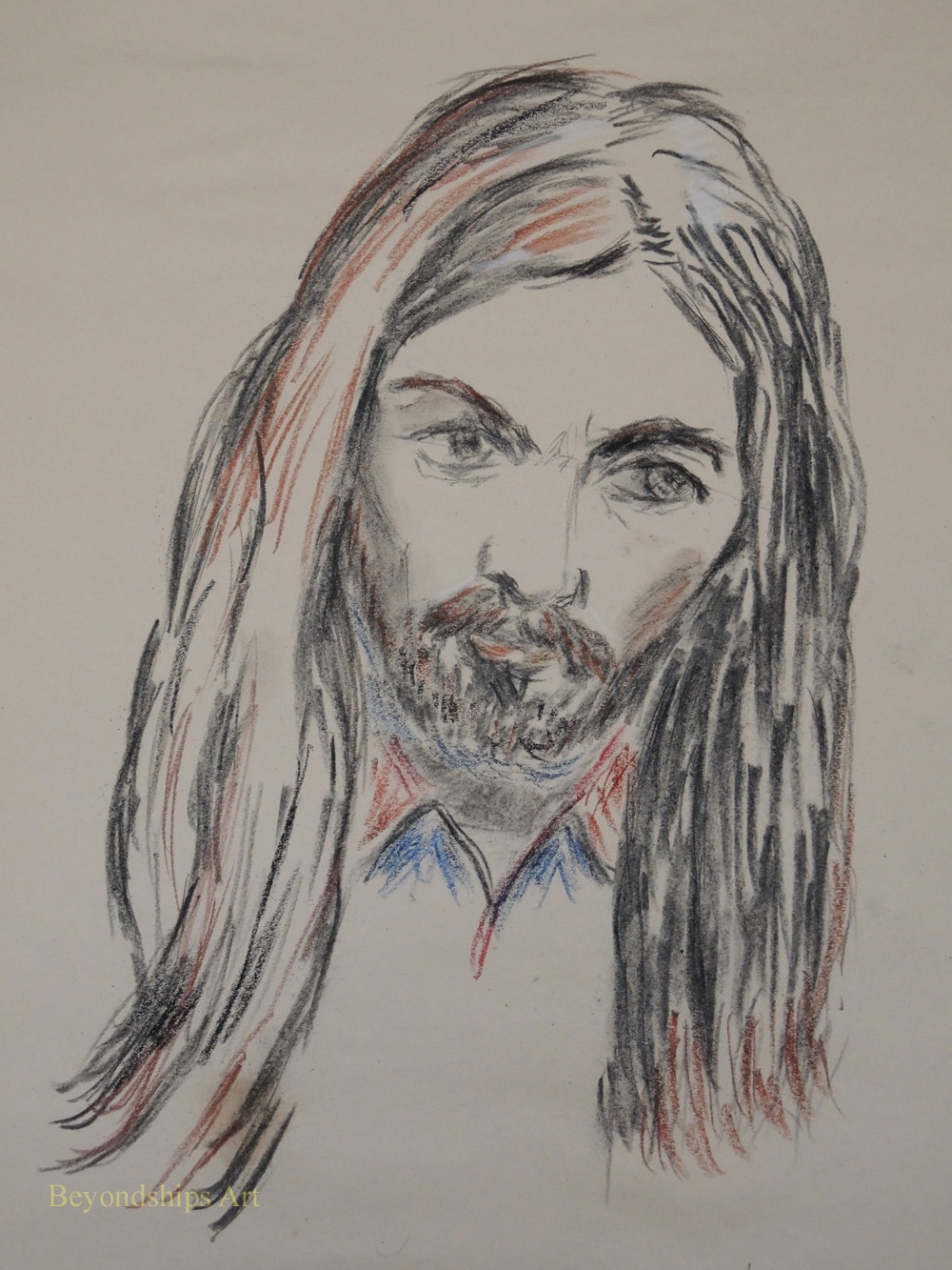
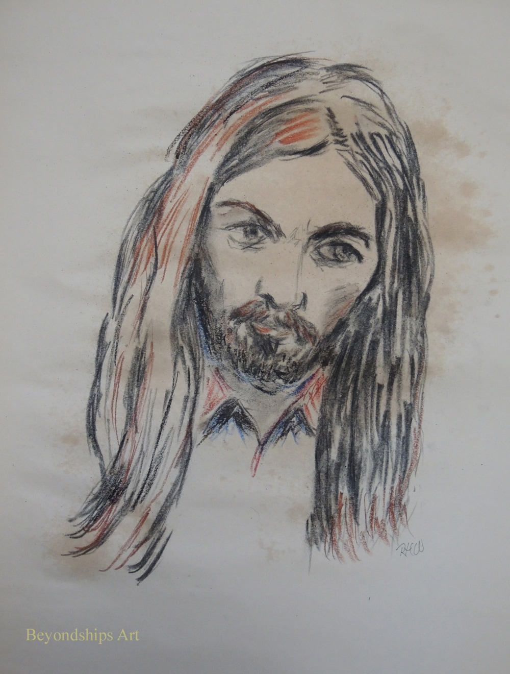
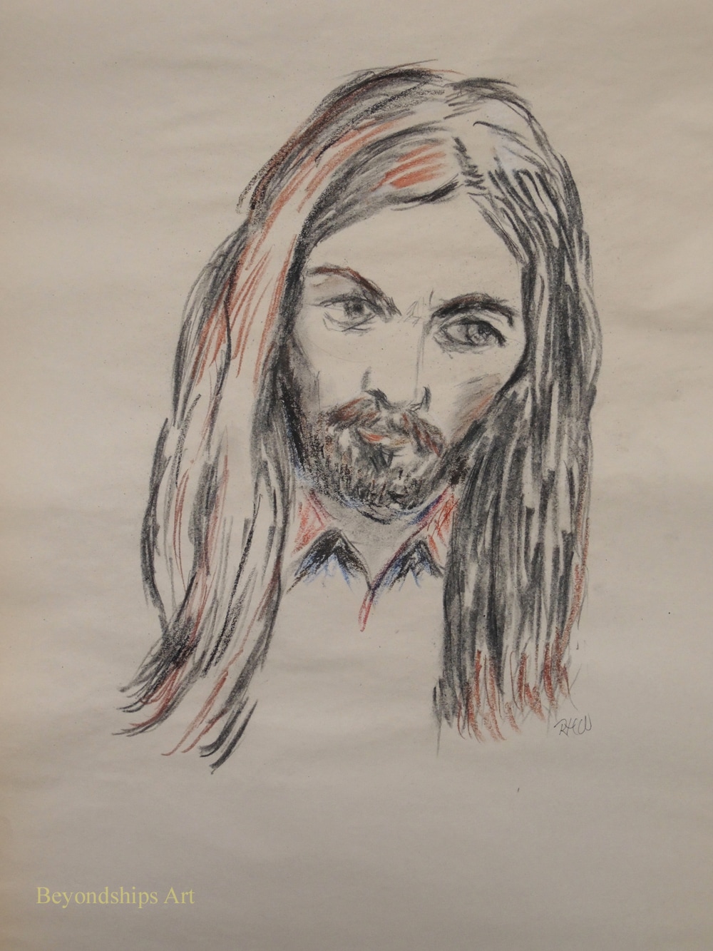
I had an idea for a drawing so I grabbed an old piece of soft charcoal and a pad of newsprint paper and began to sketch out my idea. The sketch was coming along when I decide to use my finger to smudge one of the lines. To my horror, not only did the line smudged, it all but disappeared. Clearly, this image would not stand up to being stored or displayed. By this point, the drawing had progressed quite far along. I thought about copying it over onto a better piece of paper using another medium. But that would be a lot of work and besides I liked the effect that this soft charcoal was producing. So I decided to finish the picture and see if I could find some way of fixing the image to the paper. I use charcoal quite often but I usually do not apply fixatives. I don't like chemical odors and so rather than use chemical fixatives I just store my charcoal drawings as carefully as I can and just accept that there will be some deterioration in the image. In any case, I did not have any commercially available chemical fixatives in the house. When I was in grade school, I remember an art teacher using hairspray to fix a pastel. Do they still make hairspray - - I haven't seen a can for centuries. Also, that smelled awful when the art teacher used it back in ancient times. Somewhere along the line, I had read that Vincent Van Gogh and some of the Impressionists used skimmed milk as a fixative for their drawings. There was some skimmed milk in my refrigerator and so at the risk of having to eat dry corn flakes the next morning, I decided to experiment. There was no other downside because this drawing was not going to survive without being fixed. The article that I read about Van Gogh did not say how he applied the milk to his drawings. Taking a glass and dumping it on the drawing would obviously destroy the drawing as well as create a sloppy mess. Similarly, putting some milk on a paper towel and wiping or blotting it onto the drawing would damage such a delicate image. Spraying it on seemed to be the method most likely to succeed. All sorts of cleaning products come in spray bottles these days. But when I looked through the cupboard, all of the ones that I had seemed to be nearly full and it would be too wasteful to pour out their contents for the sake of a somewhat dubious experiment. Finally, I found a small sample size spray bottle that I had been given on by the spa on a cruise ship. It was almost empty so I cleaned it out. I also had no idea what formula Van Gogh used. Did he mix the milk with something else? Was it diluted? Inasmuch as I only remembered the article saying that he used milk, I just filled the spray bottle with milk straight from the milk bottle. Since I did not know how much milk to apply, I started with a few sprays. This had an immediate effect. A little bit of charcoal came off when I touched the drawing but the lines did not disappear as they had before the milk was applied. I sprayed it a few more times and next to nothing came off when I touched the drawing. The spray had a noticeable effect on the paper. Newsprint is not the best quality paper and apparently it does not like getting moist. There was some discoloration where the spray had been applied most heavily. However, the discoloration had disappeared by the next morning. There was also some slight puckering but I imagine that would not occur with better quality paper. I find it difficult to look at my works without finding something I want to change and so I was interested in whether I could modify the drawing after the milk had been applied. Not surprisingly, I could not intentionally smudge the charcoal to create shadows. However, I found that I could still make modest use of an eraser. Also, there was no problem adding additional lines not only with charcoal but also with Conte and Cray-pas. Overall, I viewed this as a successful experiment. The picture was preserved and it was an easy process with no odor or clean-up required.
Portrait of George. Left: The drawing before applying the milk fixative. Middle: The drawing just after the milk had been applied. Right: The drawing the day after the milk was applied.
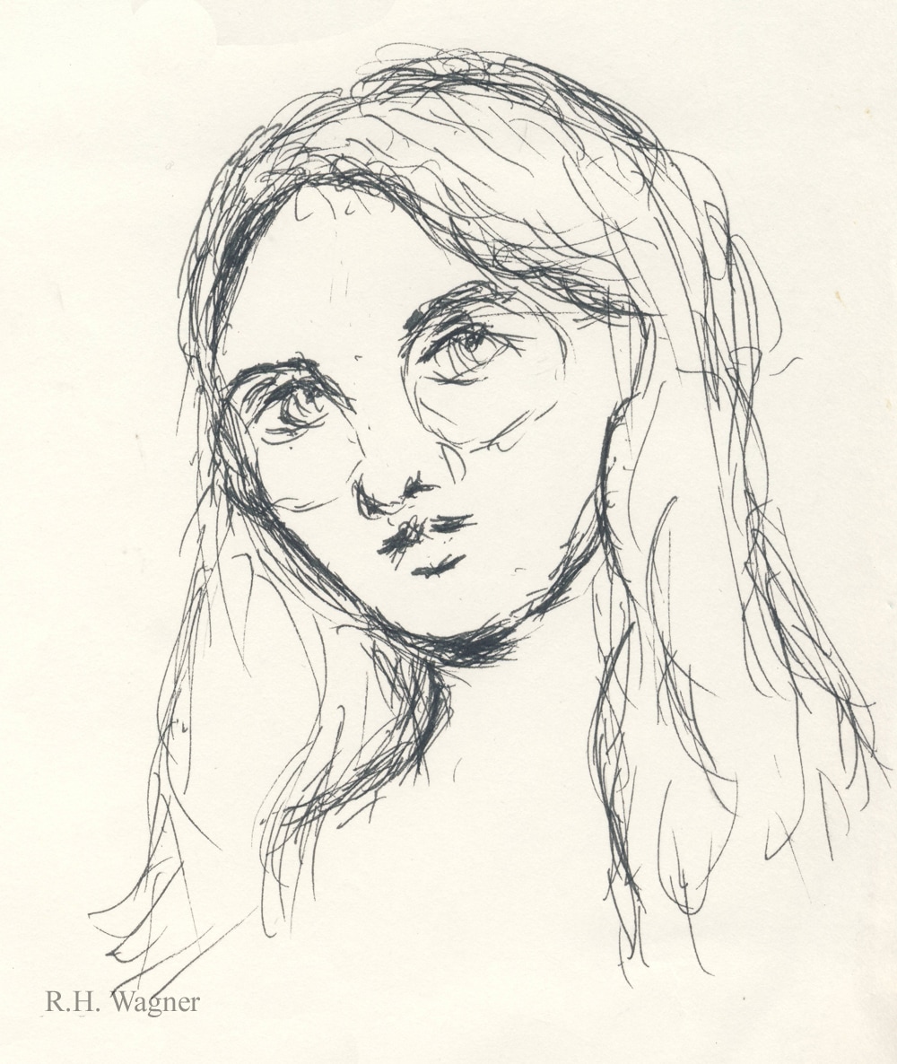
 A waiting time sketch. Sharpie on note paper. A waiting time sketch. Sharpie on note paper.
Practice, practice, practice - - you read it everywhere, it is the key to improving your skills as an artist. But in order to practice, you need time and time is hard to come by. There are a million things that need to be done everyday ranging from doing the laundry to making a living. When is there time to practice?
One thing that I have found helpful is to carry some paper and some type of drawing instrument with me and just sketch whenever there is down time. I sketch on commuter trains, when I am by myself in a restaurant, when I am waiting for the computer to upload, download or some other task that takes time. This practice has benefited me in two ways. First, I have seen a noticeable improvement in my art skills. Second, what had been wasted time is much less boring than it used to be. Train rides are not as long as they used to be. Doctors and dentists don't keep me waiting as long as they used to do. So what to draw? You can draw what is before your eyes. I once saw a video in which the popular artist Thomas Kingkaid said that he always carried a notebook in order to be able to sketch anything interesting that he chanced upon. But the places where I do my sketches are by definition boring places. There is a limit to the possibilities inherent in the inside of a railroad car. Also, people tend to become nervous if a stranger is staring at them. Consequently, I usually rely on my mind for subjects. I draw sketches of people that I have met over the years or places that I remember. In addition, I try to work out problems such as how the eyes look when a face is turned in a certain direction. I will concede that such memory-based subjects require some knowledge of the rules of proportion and perspective. However, doing these sketches has helped me understand the practical application of what heretofore had always seemed like academic theory. To supplement the memory-based subjects, sometimes I turn to the photos on my smart phone. I have included in my phone's photo gallery images of a number of people and places that have meaning for me or which I have found interesting. These photos can be used as subjects. Be careful not to drain your phone's battery, however. These sketches are not meant to be works that anyone would hag on their wall. They are just quick sketches - - often I will do a half dozen in a sitting. As above, they are intended primarily to improve my skills. Since they are not intended to be seen by anyone, I can relax while doing them. As a result, I have found that I am less tense when it comes time to do a more formal piece. When I really like an idea embodied in one of these sketches, I generally will copy it later on a larger scale. I have used an idea from one of these sketches for a whole series of more formal works. Another path is to photograph the sketch, transfer it to the computer and use it as a basis for a digital work. This need not be an expensive practice. One could purchase small sketch books and a good drawing instrument. However, most of the sketches that I have done were on the backs of scrap paper. The little note pads that hotels provide to jot down phone messages are also a favorite. As for the instrument, I often use golf pencils because they fit easily in my pockets. However, I prefer a pen-like Sharpie. One unintended consequence of this practice is that people talk to you. Most people do not ordinarily come across art work being created. They want to find out what is going on and see the work. Often they tell you a little bit about themselves. It has been a very pleasant experience thus far. |
AuthorRich Wagner is a writer, photographer and artist. Archives
November 2018
Categories
All
|
 RSS Feed