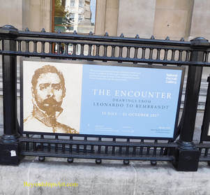
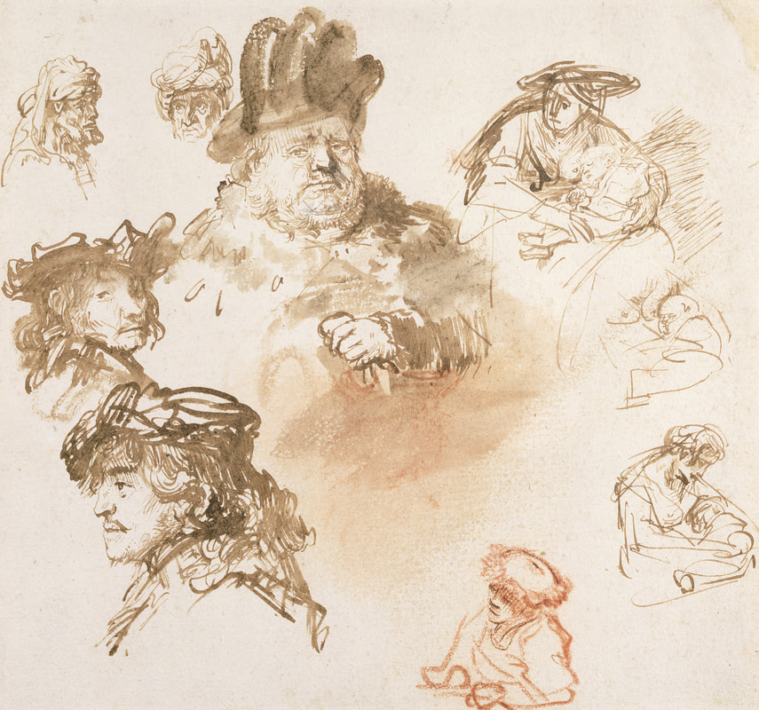
 The Encounter, Drawings from Leonardo to Rembrandt, at the National Portrait Gallery in London, is the NPG's first exhibition of Renaissance portrait drawings. It includes 48 works by artists of the highest caliber and includes works from some of the most important collections in the United Kingdom including the Royal Collection. Just bringing together works by the likes of Leonardo Da Vinci, Rembrandt Van Rijn, Hans Holbien the Younger, Anthony Van Dyck and Albrecht Durer is enough to make an exhibit important. However, the NPG has striven to go beyond just creating an assembly of works by great artists by selecting works that highlight the interaction between the artist and his subject. Every portrait drawing involves the artist who renders the image and the subject, i.e., the one whose image is being rendered. Usually, this involves at least two people but in the case of a self-portrait, there is only one person involved. In such instances, the artist plays both roles. In this encounter, the subject provides not just his or her physical form but also the emotions and thoughts that animate that form. The artist not only recreates the image before him or her but interprets the subject in light of his or her thoughts and emotions. It is this interaction that makes art different than the process of copying a document on a copier. During the Renaissance, artists made their living primarily through painting. Drawings were usually not done as finished works. Often they were done as preparatory works where the artist was trying to develop an image that would later be used in a finished work, perhaps as a commissioned portrait painting or as a face in a mural of some Biblical scene. Indeed, in one of the Holbeins, the artist scribbled notes as to the subject's complexion and the fabric of the clothing the subject was wearing so as to guide him in the final painted portrait. Drawings were also done for practice. The very informative pamphlet distributed by the NPG explains that young artists would often learn their craft by copying collections of images done by their master. Practice continued even when an artist became established as seen in a sheet of drawings by Rembrandt that contains multiple quickly sketched images. Because these works were done primarily for the artist's own use, they are often freerer than the same artist's more polished finished paintings. The subjects are often more informal and appear in their own attire rather than say in classical costume. As such, the encounter - - the interaction between artist and subject - - is closer to the surface and more easily observed.
Pictures from the Exhibition: A sheet of figure studies with male heads and three sketches of a woman with child by Rembrandt van Rijn c.1636 (above left).
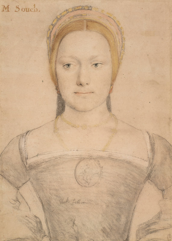
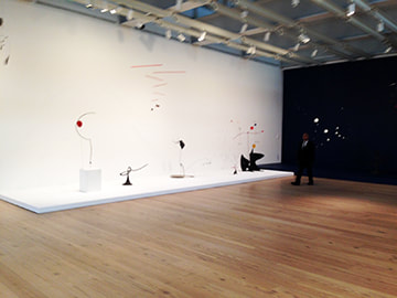
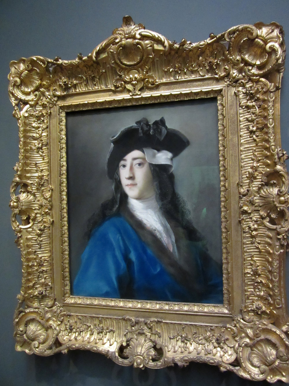
Young Woman in a French Hood, Possibly Mary Zouch, by Hans Holbien the Younger c. 1653. (Images courtesy of the National Portrait Gallery).  Drawn to Greatness, Master Drawings from the Thaw Collection is the largest collection of drawings yet to be exhibited at the Morgan Library and Museum and includes some 150 works. However, beyond the quantity of works, this exhibit is important because of the quality of the works. The artists represented in the exhibit are a Who's Who of western art from the Renaissance to the 20th century. Consequently, works of beauty and excellence unfold as you walk through the galleries. The exhibit is drawn from the Thaw Collection, a gift of some 400 sheets by Eugene and Clare Thaw. It was amassed over the last 50 years by Mr. Thaw, an art dealer and collector. Interestingly, Mr. Thaw began his career handling the works of contemporary artists only later expanding into Old Masters. Mrs. Thaw encouraged her husband to keep some of the drawings that he was particularly enthusiastic about and so the collection was born. Works from the Renaissance are the earliest works in the exhibit. As the signage at the exhibit tells us, this was when artistic drawing changed from mechanically recording an image to intellectually creating an image. The exhibit then proceeds chronologically through the centuries, revealing the many ways artists used drawing to create images. The term drawing is used here in its broadest sense. It does not just encompass black and white images done with graphite or charcoal. Rather, the exhibit shows that there are many forms of drawing often involving color. These include pastels, watercolor, inks, chalks, and even oil paint to name a few mediums. Indeed, I was struck by how artists in the 18th century would use several different mediums in their works. Unfortunately, somewhere along the line, this multi-medium practice became lost so that today on social media an artist can be accused of “cheating” if a work contains say both gouache and watercolor. The works here include finished pieces as well as works done in preparation for a painting or mural. However, because the drawings were often for the artist's personal use they are sometimes more revealing than works produced for sale as they are not as tempered by the need to please the tastes of the market. Turner's “The Pass of St. Goddard,” for example, is a swirling mass of colors that is closer to abstraction than realism. Still, the drawings bear the hallmarks of the style which is associated with each artist. To illustrate, an Ingres' drawing looks like an Ingres portrait. You do not need to look at the signage to tell if a drawing was done by Picasso. As a result, the exhibit is a condensed survey of the major ideas in European art. I found myself spending the most time with the late 19th century French masters. Degas is known for his pastels and so it was not surprising to find several of them on exhibit. But there was also a rare black and white drawing by Monet, the master of color. There are also delightful watercolors by Renoir and Morisot. The innovative works by Cezanne take watercolor in a different direction. In addition to being an important exhibition for art lovers, I would also recommend this exhibit to those who make art. It is perhaps easier to push back the curtain and analyze how a work was done with a drawing as opposed to a finished painting.  “Calder: Hyermobility” at the Whitney Museum of American Art is an exhibit of sculptures by Alexander Calder. It focuses on the importance of motion in Calder's work. Alexander Calder came from an artistic family. His father and grandfather were both sculptors. His mother was a professional portrait painter. Not surprisingly, Calder did art work from an early age and even had studios in the basements of several of the houses that the family occupied while he was growing up. Knowing the difficulties associated with being a professional artist, his family did not encourage Calder to follow in their footsteps. Instead, he studied to be become a mechanical engineer. Following his graduation from the Stevens Institute in 1919, Calder held a variety of jobs including being a hydraulic engineer and working as a mechanic on a steam ship. Calder, however, found this work unsatisfying and decided to make art his career. To this end, he enrolled in the Art Students League in New York. In 1926, he moved to Paris where he established a studio and became friends with a number of avant garde artists. Following a visit to Piet Mondrian's studio, he decided to embrace abstract art. During this period, Calder became interested in creating sculptures with movable parts. His early works along this line moved by cranks and motors, perhaps reflecting his engineering background. By the early 1930s, Calder had returned to the United States and his works were less mechanical. Instead, the works moved either in response to touch or to the wind. Marcel Duchamp coined the term “mobiles” to describe Calder's sculptures. The Whitney exhibit includes several of Calder's mobiles. Some are freestanding while others are suspended from the ceiling. Even when they are static - - which they are most of the time - - the graceful lines and pure colors of these sculptures make them appealing. At specified times during the day, a staff member appears and “activates” some of the sculptures. Typically, this is done by giving one part of the sculpture a gentle push setting it in motion. The movement causes the image that the viewer is seeing to change. Whereas a portion of the sculpture was say pointing in one direction originally, it points in a number of different directions as it moves. As a result, the overall shape of the sculpture changes, becoming a new image. In addition to the mobiles, the Whitney has one of Calder's large static sculptures in the center of the exhibit. These Calder sculptures were dubbed “stabiles” by Jean Arp in 1932 to distinguish them from Calder's mobiles. With a stabile, the image changes as the viewer moves around the object. In this, the process is not different than traditional sculpture. However, here the forms are abstract - - graceful arches arising from seemingly delicate points. Over the last 90 years or so, the public has become familiar with abstract sculpture. However, the elegance of Calder's designs, both static and kinetic, are such as to have enduring appeal.
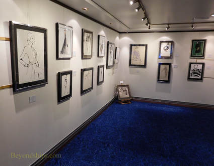 It is not unusual to find an art exhibition on a passenger ship. Most cruise ships have an art gallery that sells prints and original works of art. What is unusual is for a ship to host a preview of an art exhibit that will be seen on land in a major city. As part of its 2017 Transatlantic Fashion week, the ocean liner Queen Mary 2 held a preview of “Drawing On Style: Original Fashion Illustration.” This exhibition was a preview of a larger exhibition held at the Gray MCA Cheryl Hazon Gallery in New York City. The preview presented 21 works by 10 artists. It was held in the annex to QM2's permanent art gallery. Until fairly recently, illustration was a somewhat disparaged stepchild of fine art. In part, this was due to the fact that illustration has commercial connections. It is often used in advertising to sell a product or service. Also, illustration was often used in conjunction with a book or a story to elaborate on an idea or a point made by the author of the book or story. In such situations, it was argued that the illustration is subservient to the book or story and not a stand alone artistic concept. The old view of illustration lost ground as people came to realize that a good illustration can stand on its own without regard to the product or story it was commissioned to serve. Indeed, at this exhibit, it is hard to detect what fashion designer's conept the works were originally intended to illustrate. It s only by reading the signage that you find that a given work was done for one of the great fashion houses or a well-known fashion magazine. In other words, the works stand on their own. The works on display were drawings, often pen and ink with a brushed wash but also some graphite works and some watercolors. They were not traditional drawings. Rather, like the Mask paintings of Henri Matisse, they distill the subject matter to its essential lines. Colin McDowell, fashion commentator and one of the artists whose works were included in the exhibit, explained: “In fashion illustration, you are creating a mood, a feeling and you can do it in very few lines. Elimination, just get the essence.” In his remarks opening the exhibit, Mr. McDowell pointed out that fashion illustration reahed its zenith with the fashion magazines of the 1930s and 40s, which were aimmed primarily at upper class ladies. As the demographics of their readership changed in the 1950s, the publishers began to favor photographs over illustration in order to appeal to a younger and broader audience. By the end of the century, photographs had all but replaced illustration in the fashion magazines. The exhibit chronicles this period with examples of works from throughout this period. It includes several works by Kenneth Paul Black, who Mr. McDowell called “the last of the great fashion illustrators.” However, I was most attracted to the works of contemporary British artist Jason Brooks because of the emotion he conveys in a minimum of lines. It was an exhibit rich in fashion history. But the pictures were not just of interest for their historical value. They were good pictures.  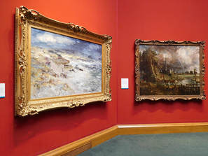 “Constable and McTaggart: A Meeting of Two Masterpieces” at the National Gallery of Scotland is a small exhibit that provides insight into the evolution of art.
John Constable was one of the great English landscapes. Born in 1776 into a wealthy merchant family, Constable intially struggled for success but by the end of his life, he had become a member of the Royal Academy and had achieved fame in Britain and in Europe. The paintings that established Constable's reputation during his lifetime are polished works that follow in the tradition of the old masters. His inspirations included works by Claude Lorrain and Peter Paul Ruebens. However, distinguishing Constable's works from traditional landscapes was considerable emotion. “Painting is but another work for feeling.” Some of Constable's most successful works were monumental paintings that he called “six footers.” These monumental works have impact not just because of their size but because of the aforementioned emotion that Constable put into his works. His last six-footer “Salisbury Cathedral From the Meadow” (1831) is on display at the exhibit. The cathedral is seen in the distance with dark storm clouds surrounding it. While Constable disdained the traditional practice of altering nature to create an ideal landscape, he has added a rainbow that is not in the preparatory studies for the painting. Hope for the future after the passing storm. In preparation for the paintings he exhibited, Constable would do oil sketches. These paintings are much more impressionistic with bold expressive strokes. They were never meant for sale or public display but rather were meant to be references, memorializing a particular scene or a cloud formation etc., for use in a future more polished work. As a result, the oil sketches were not exhibited until after Constable's death. The exhibit contains several of these oil sketches. William McTaggart was also a landscape painter. He is sometimes called the “Scottish Impressionist.” Born in 1835, McTaggart was a generation or so after Constable. Nonetheless, he was greatly inspired by Constable. Constable's influence on McTaggart can clearly be seen in the exhibit. For example, McTaggart's “The Storm” is a monumental work of the size of Constable's “Salisbury Cathedral.” However, the style of the work is similar to the style of Constable's oil sketches with loose expressive brush strokes and impressionistic vagueness. Like Constable's, McTaggart's works are full of emotion. The exhibit thus shows how an idea developed as a tool by an artist in one generation can be carried forward in a later generation to become the final end product. 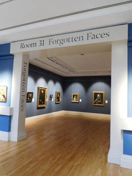 “Forgotten Faces” is an exhibit of some 11 portraits at the National Gallery of Ireland by Spanish, Italian, Dutch and Flemish artists done in the 16th and 17th centuries. What binds all of these portraits together is that the identity of the sitters have been lost over time.
The signage at the exhibit asserts that the siters had their portraits painted in order to “mark significant events in their lives, to flaunt their wealth, or to reveal their social standing. All wanted to register their existance in a medium that would outlive them.” However, because the names and life stories of the siters have been lost over time, the exhibit asks “what is the significance of such nameless portraits?” It answers that question: “Perhaps their value lies in the fact that they serve as reminders of the brevity of life, and lead us to remember how we want to be remembered, if at all.” Elsewhere, the museum writes: “Ultimately, however, this display of forgotten faces encourages us to consider people's thoughts about time, memory, identity and legacy, and how portraiture provides us with the illusion of permanence in a changing world.” I found myself in fundamental disagreement with the thesis of the exhibition. The significance of a portrait does not come from the identity of the sitter. The world's best known painting, the Mona Lisa, is a portrait and while people may be curious as to who the woman with the mysterious smile is, who she is is irrelevant. Similarly, Van Gogh's portrait of the postmaster of a small French town is not an important painting because of its subject's identity. A successful portrait is one that says something about the person depicted such as their emotions and their personality. It is self-contained. All that we need to know about the subject is contained in the portrait. The sitter's name, life story and other extrinsic facts are irrelevant. A portrait also conveys something about the artist. The image is not a mechanical recreation of how the sitter looked. Rather, it is the person as seen through the artist's eye. It is an image as interpreted through the artist's intellect, emotions and perceptions. Therefore, if the subjects of these paintings were seeking a form of immortality by having their portraits painting, they achieved it. Some 500 years after their time, people are looking at their images and seeing something of their personality. The museum at times appears to realize this point. For example, in “Portrait of a Spanish Noble Woman” by an unknown artist, the signage says: “this is a highly controlled image that reveals what she and the artist wanted to disclose about her place in society.” Thus, the work not only tells us something about the sitter but also about her times. Similarly, in “Portrait of a Man Aged 28”, also by an unknown artist, the signage says: “His youthful hopeful face lends the portrait poignancy.” Thus, it is conceded that this portrait does convey something about the person depected. While the historical facts of that person's life have disappeared, we nonetheless know something about him through the image that the artist created. The sign, however, goes on: “His anomynity is a reminder that our lives exist in the memories of people we know, and these memories can disappear within a generation or two.” But such a conclusion about the fleeting nature of existence does not really follow from the fact that we do not know the name of the person shown in a particular portrait. Even in a well-documented life, we do not know a person to the same degree as his or her friends knew that person. Thus, famous or anoymous, it can be said that our lives only exist in the memories of the people we know. Once again, the degree to which we know extrinsic facts about a person depicted in a portrait is irrelevant to whether that painting speaks to us. Everything that we need to know about that person is contained within the four corners of the portrait. Of course, some artists are better able to capture and communicate something about their subjects than are others. Thus, we find out more about the people depicted in some works than we do from others. The exhibit contains works by some well-known artists such as Veronese and Tintoretto but the works of the unknown artists are often just as moving. Although a small exhibit of second tier works, “Forgotten Faces” is successful because of the thought-provoking discussion of portraiture. “Poussin, Claude and French Drawing in the Classical Age,” an exhibition at the Morgan Library and Museum in New York, looks at the role of drawing during one of the peak periods in French culture. Although France had long been a powerful European nation, it rose to new heights in the 17th century during the reigns of Louis XIII and Louis XIV. In essence, it became the leading power in Europe politically and militarily. At the same time, the arts flourished under the patronage of the French royal court and the ducal court of Lorraine, then an independent nation but later to become part of France. During this time, French artists often traveled to Rome to study both the work of the ancients asforma well as the Italian Renaissance masters. When they returned to France, they brought with them new ideas that stimulated the native talent. As a result, Paris became a center for artistic activity. Drawings served three purposes. First, artists often made drawings to capture scenes that they encountered. Afterall, they did not have iPhones. Second, drawing were used to make studies in preparation for paintings and other more complex works. Third, drawings were done as completed works. This was often the case with portrrait drawings, which members of the court collected and placed into albums. Two of the most important French artists of this period were Nicolas Poussin and Claude Gelleee – better known as Claude Lorrain. Poussin was from France but first achieved success in Rome. In fact, he only returned to France because he was summoned home by the King and then he only remained there for two years. Poussin was very interested in classical antiquity and his work often focused on classical mythology, history and biblical scenes. His drawings were done in preparation for his paintings. The drawings in the exhibit show that he felt free to use a looser style that at time borders on the abstract in his drawings rather than the more precise style of his paintings. Claude Lorrain also studied in Rome and also eventually returned to settle in that city. Lorrain was interested in nature as a manifestation of the divine. He would do sketches directly from nature but he would alsoDaniel rearrange features in his finished landscapes to accord with idealized principles. I found his more free flowing sketch style more appealing than his more formal finished style. Poussin and Lorrain are not the only artists represented in this exhibit. We see that other artists were heavily influenced by classicism while at the same time other artists were developing naturalism. In the former area, the style is too cold and impersonal for me. In the latter group, Simon Vouet's Study of a Woman Seated on a Step has an informality that appeals to modern tastes. However, the presence of a study of hand on the same piece of paper reveals that it was only meant as a preparatory piece. Perhaps the most appealing of the drawings in the exhibition are the portraits. Vout's portrait of his patron Louis XIII presents the sitter as an affable human being rather than a remote monarch. In contrast, Daniel Dumononstier's Portriat of A Gentleman of the French Court is technically excellent but the sitter comes across as quite cold. One thing that surpised me was the color of the drawings. Inasmuch as the works are nearly four centuries old, one might well expect yellowed paper and faded ink. However, quite a few of the works were done on light brown paper and used brown ink. Thus, they probably looked much the same four centuries ago as they do today. The exhibition includes more than 50 drawings. Most of these are from the Morgan's own collection but they have been supplemented with works from the Metropolitan Museum of Art and from private collections. The placards next to the various pieces are excellent. In addition, there is a complimentary booklet discussing the works. I feel this is particularly important because for the general public, this is not a particularly familiar period of French art and the information provided by the Morgan explains its significance. This makes it a more enjoyable as well as educational experience. 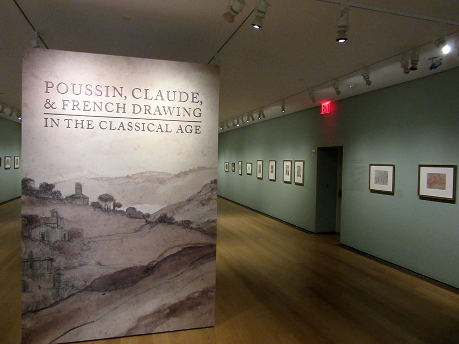 “Eighteenth Century Pastel Portraits” at the Metropolitan Museum of Art is a small exhibit of European pastels. It includes, French, Italian, German and British works from the museum's collection. An exhibition of pastels is not all that common. Works done in pastel are light sensitive. Prolonged exposure to light causes some pigments to fade. In addition, most pastels are done on paper and paper can fade or deteriorate with prolonged exposure to light. As a result, museums generally exhibit pastels in rooms with dim light and even then only for brief periods. The difficulties associated with such arrangements prevent museums from mounting pastel exhibitions very often. Essentially, a pastel is made up of pigment and a binder such as gum. The combination is then molded into a rounded or squared stick. The artist can then use the sticks in the same manner as a pencil. In other words, he or she can create a work without using brushes or mediums such as oils. Historically, pastels were often referred to as crayons. However, pastels differ from modern crayons in that the binder in crayons is usually wax. Pastels are more powdery than modern crayons. While crayons stick to paper better than pastels, pastels are easier to blend and they cover the ground more easily than crayons. Another somewhat confusing term that you often see is “pastel painting.” A pastel painting merely means that the pastels cover the entire ground. A pastel that leaves part of the paper exposed is a “pastel sketch.” It is believed that pastels were invented in the 15th century. There is evidence that Leonardo Da Vinci knew of pastels from a French artist in 1499. In any event, pastel portraits became very popular in Europe during the 18th century. People were attracted by the luminosity of the pastels and the speed and ease with which they could be used. The exhibit presents works by several of the leading pastelists of that era. Rosalba Carriera specalized in pastel portraits and became one of the most successful women artists of all time. She began by painting miniatures but by 1703, she had mastered pastels. Not long after, merchants, nobles and visitors to Venice were queuing for her pastel portraits. She went to Paris and painted the king and his nobles. She went to Vienna and the Holy Roman Emperor became her patron. Carriera is represented by a portrait of a young Irishman dressed in a cloak and tricorne hat. The mask that he has shifted away from his face shows that he is in Venice for the Carnival. Proud and dashing, it is the image of a young noble living life to the full in that romantic city. John Russell was the leading English pastel portraitist. In fact, he was appointed pastel artists to King George III. He also wrote the still inflential book Elements of Painting with Crayons. Russell is represented by three works. One is a charming portrait of his daughter with a baby. The other two are commission portraits of a merchant and his wife. She looks like the dominate one of the couple while he seems to have the look of someone who knows when he is well off. The signs by the paintings tell us that she was an heiress and that when the couple married, he took her family name. Adelaide Labille-Guiard was a member of the French royal academy of painting and sculpture. She is represented by a portrait of Elisabeth de France, the younger sister of King Louis XVI. A virtuous and religious person, there have been calls for pleasant looking person's beatification. However, there is always an element of tragedy in pictures of the members of this doomed family. The images in this exhibit are in sharp contrast to the familiar pastels of artists such as Degas. Rather than strong expressive lines, these works are soft and smooth with no trace of the artists' strokes. Still, they subtlety convey the personalities of the sitters.
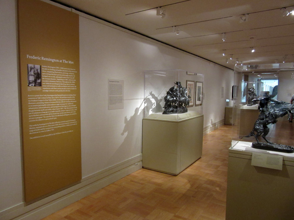
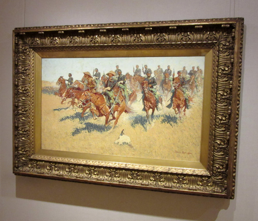
“Frederic Remington at the Met” is a small, introductory exhibit presenting some 20 paintings, sculptures, works on paper and illustrated books relating to Remington. Although famous for his depictions of the Old West, the artist lived during much of his life in the New York City area. It is known that he came to the Metropolitan Museum (the "Met") to study works. In addition, several of his works came into the Met's collection during Remington's lifetime. Frederic Remington was born in upstate New York. His father, who was a colonel in the Union Army during the Civil War, hoped that his son would follow a career in the military. However, when Frederic entered Yale in 1878, he choose to study art. More interested in playing football than studying, he left Yale after only three semesters. With the idea of investing the inheritance he received after his father's death in a mine or a ranch, Frederic set out for Montana in 1881. Although his investment plans did not pan out, it was an experience that would shape the rest of his life. Remington was captivated by the spirit of the Old West and sketched the cowboys, soldiers and Native Americans that he encountered. He would return to the West again and again throughout his career as a source of inspiration. Remington sold his first sketch to Harpers Weekly in 1882. This was the beginning of a successful career as an illustrator. In addition to numerous magazines, Remington would go on to illustrate books by Theodore Roosevelt and Owen Wister as well as Remington's own novels. Returning east, he moved to Brooklyn and to build his artistic skills enrolled for three months at the Art Students League of New York. He also studied works on display at the Metropolitan Museum, particularly those of the French academic painters. The exhibit gives a glimpse of Remington's work as an illustrator. There are examples of published works as well as one of his preliminary sketches made on the scene for a work that would be completed in the studio. However, the most interesting of these works are monochrome oil paintings. At first glance, these appear to be black and white photos of paintings. However, you quickly see that they are the original paintings. They were done in black and white to facilitate their reproduction in the magazines of the day. Remington was not satisfied with being an illustrator. At that time, illustration was considered a lesser form of art or, in some circles, not really art at all. In illustration, it was argued, the objective is to support the written words, the concept and inspiration thus coming from the writer rather than the mind of the illustrator. Moreover, illustration was viewed as too commonplace and too commercial. To achieve recognition as a serious artist, Remington began exhibiting paintings in 1887 and had his first solo exhibition in 1893. Although his works were popular, he remained somewhat dissatisfied and later in his life he burnt many of his early works. A highpoint of the exhibit is Remington's painting “On the Southern Plains.” One of Remington's later works, its color and style reflect the artist's movement away from French academic painting toward a more impressionistic style. It shows a group of cavalry soldiers, guns drawn riding to meet some unseen foe. They are not formed in a battle line like cavalry soldiers preparing to attack did in those days. Rather, they ride as a group of individuals - - very American. As throughout Remington's works, the people depicted are noble and engaged in a worthy pursuit. Whether that is a historically accurate portrayal of the Old West is irrelevant. Like a John Ford movie, it has a romantic, heroic appeal and that is good for the soul. In 1895, the sculptor Frederick Ruckstull taught Remington how to do sculpture. Remington went on to create some 22 different bronzes. The exhibit has several of them on display including his first statue, “The Bronco Buster.” Remington's statues are small rather than monumental. There are no busts of famous men. Rather, the statues are of the common people of the Old West. While the artists of the Hudson River School and other artists who depicted the frontier were interested in its wondrous landscapes, Remington was interested in people. And the bronzes depict people in action - - whether it is a cowboy on a bronco, a mountain man going down a steep slope or a Cheyenne warrior speeding along on a horse, there is motion in these statues. Tragically, Remington died at the age of 49 due to complications arsing from an appendectomy In those days, it was the fashion for successful men to overeat. As a result, the once lean athlete was some 300 pounds when he died. Moreover, health problems brought on by his weight prevented him from working outside the studio towards the end of his life - - something he very much desired to do as he became interested in the work of the Impressionists.
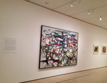 Joan Mitchell's "Ladybug" Joan Mitchell's "Ladybug" Making Space: Women Artists and Postwar Abstraction, a temporary exhibit at the Museum of Modern Art in New York City, brings together the works of more than 50 artists to illustrate the contribution of women artists to modern art. The works come from the Museum's collection. Following World War II, the art establishment became dominated by abstract art. Although the artistic community at the time regarded itself as avant garde and progressive, it was not very tolerant of competing ideas. For example, the doors of the galleries were closed to artists working in more traditional or realist styles. So too, the galleries - - and too often the minds of the art world - - were largely closed to women artists even those doing abstract work. In the post war period, there were few, if any, mutual support groups for women artists. Watching my mother's struggle (see Art of Valda), what help she received seemed mostly to come from male artists who she had met while at the Art Students League of New York. Thus, for a woman artists to become recognized during this period was very much an act of individual achievement. This exhibit brings together the works of a number of woman artists who managed to overcome the prejudice of the time. It documents that women indeed contributed to the various schools of abstraction that dominated this period. Although the exhibit presents these works as works of women artists, it is important to note that these artists did not identify themselves as women artists and were not just competing against other women. The goal was to be artists who produced art that would compete in the marketplace of ideas with all other art regardless of the sex of the person who produced it. Perhaps the best known school of abstraction at the time was Abstract Expressionism. The enormous drip paintings of Jackson Pollock are hallmarks of this school. It was widely believed that such monumental works required masculine strength and gestures. However, the exhibit documents that women artists were producing similar works on a large scale. These artists included Lee Krasner, the wife of Jackson Pollock, who is represented in this exhibit by her work “Graea.” The curves of paint in this work have an almost floral, organic look. Abstract expressionism is about emotions and the work I found that evoked more reaction in me was Joan Mitchell's “Ladybug.” I found the color combinations visually pleasing and the lines moving and exciting. I also was impressed by Helen Frankenholer's “Trojan Gates.” Although a large canvas, it seemed more cohesive and unique in its approach than many abstract expressionist pieces. At the opposite end of the spectrum is “Reductive Abstraction.” Here, the idea was to remove the human touch from the work. In the 1950s and 1960s, there was much talk about human isolation and the potential that the mindless application of science would create a sterile environment in the future. Accordingly, some artists created futuristic works based upon mathematical or scientific concepts that were devoid of the human touch. Jo Baer's “Primary Light Group: Red, Green and Blue” is made up of three canvases, each of which is primarily a blank white square. Around the outer edge of each of the squares is a narrow black border. The three canvases differ only in that on one there is the color of the narrow space between the white area and the border. On one it is red; one, it in green; and one it is blue. The concept relies on the work of physicist Ernst Mach on the optical effects of placing colors next to black. I found the work too devoid of emotion. In addition, it reminded me of the demonstrations in high school science class when the teacher would illustrate some principle by using a clever but meaningless gimmick. The exhibit also shows that women artists made contributions in bringing abstraction to textiles. Vera Neuman's “Stone on Stone” made in the 1950s appears to be a forerunner of the designs used in the fashion revolution of the 1960s. A more disquieting work is Magdalena Abakanowicz's “Yellow Abakan,” a large, rumpled piece of fiber that hangs on the wall like the corpses in a butcher's freezer. It is not pretty but it evokes emotion. Finally, the exhibit concludes with Eccentric Abstraction.” These are works where the artist used materials not traditionally used in making art. The challenge in such works is to add enough creativity to the project so that it becomes a work of art rather than a pile of junk. Lee Bonteciu's “Untitled” employs pieces of used canvas conveyor belts to form a swirling, three dimensional object. Its industrial coloring gives it a dark, foreboding feel. Once again, it is not pleasant looking but it is evocative of emotion. |
AuthorRich Wagner is a writer, photographer and artist. Archives
November 2018
Categories
All
|
 RSS Feed