 “Public Parks, Private Gardens: Paris to Provence” at the Metropolitan Museum of Art is a large exhibition that places in context much of the art created in France from the French Revolution to World War I. It explains why so much attention was paid by artists such as the Impressionists to the out doors as a subject.
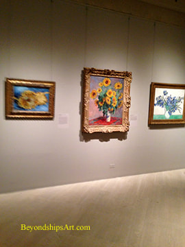
Extending from the late 18th century through the 19th century a passion developed in France for parks and gardens. Several factors came together to fuel this passion. First, as a result of the French Revolution, the parks and hunting reserves that had heretofore been open only to royalty and the aristocracy, became open to everyone. This access helped to open the eyes of the public to the beauties of nature. Second, the Industrial Revolution also changed the character of society. The middle class grew and people had more leisure time. They wanted green spaces, both public parks and private gardens, where they could escape from the stresses and pollution that were the less attractive side effects of industrialization. Accordingly, in the grand re-design of Paris that took place in the mid-19th century, Baron Haussmann included tree-lined boulevards and some 30 parks and squares. Other cities and towns throughout France followed suit. Third, it was also a period of exploration and travel. Exotic plants were being brought back to France, stirring the public imagination. The Empress Josephine, first wife of Napoleon, and a celebrity in her day, spurred public interest in such plants by making her greenhouse at Malmaison a horticulture hub for exotic species. Artists were not immune from these forces. The natural world, depicted in landscapes and in still lifes, had long been a subject for art. However, a new enthusiaum developed. The painters of the Barbizon School took inspiration from the former royal hunting grounds at Fontainebleau. Later, the Impressionists, whose aims included depicting scenes of modern life, reflected public's passion for parks, gardens and the natural world in their works. While this exhibition includes earlier works, the Impressionists and the artists that they influenced dominate the exhibition. For example, in the gallery “Parks for the Public,” we see works by Camille Corot, Théodore Rousseau and others of former royal hunting reserves. However, you also have masterpieces by Calude Monet and Camille Pissaro of city parks in Paris. There is also a wonderful watercolor by Berthe Morrisot “A Woman Seated at a Bench on the Avenue du Bois” as well as a study by Pointillist George Seurat for “"A Sunday on La Grande Jatte." In the gallery “Private Gardens,” the works reflect the fact that people wanted to have their own green spaces where they could cultivate plants and escape from the outside world. Many artists were also amateur gardeners during this period. Of course, the dominant figure here is Claude Monet who was painting garden scenes long before he created his famous garden at Giverney. However, lesser known watercolors of garden scenes by Renoir and by Cezanne should not be overlooked. With regard to portraiture, we see that the artists blurred the distinction between portraits and genre painting. They are both depictions of individuals and scenes of everyday life. As a result, the identity of the sitter is no longer paramount if important at all to the success of the work. Furthermore, nature is an equal partner in these scenes, not just a background. To illustrate, Edouard Manet's “The Monet Family in Their Garden at Argenteuil” is a portrait of Monet and his family. The figures are arranged in a relaxed manner rather than in traditional portrait poses. Thus, it is also a scene of everyday life. Moreover, it would be just as successful if the figures were an unidentified family because it is a captivating garden scene. The passion for nature also brought about a revival of interest in floral still life painting. The exhibition presents examples by Manet, Monet, Cassat, Degas, and Matisse to name a few. But Vincent Van Goghs paintings of sunflowers and irises attract the most viewers. Given the popularity of the Impressionists and their broader circle, one would expect any exhibit in which they are prominent to be successful. However, the Met has done a good job here of supporting the theme of the exhibition. In addition to the paintings, there are drawings, prints contemporary photographs and objects relating to this theme. The signage is also good. 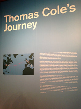 Thomas Cole and the Hudson River School of landscape painting are distinctly American, depicting the magnificent scenery of the United States in the first part of the 19th century. In “Thomas Cole's Journey Atlantic Crossings,” as exhibition at the Metropolitan Museum of Art, we wee how both Cole's art and his thinking was shaped by his experiences in Europe. Cole was born in northwest England in 1801. The Industrial Revolution was beginning and during his boyhood, Cole witnessed the transformation from a rural society to an industrial one with nature giving way to factories and crowded cities. For a time, the young Cole worked in the new mills designing patterns for textiles. However, in 1818, facing financial hardship in England, Cole's father moved the family to the United States. As a young man Thomas Cole traveled around Pennsylvania and Ohio painting portraits. Although he was largely self-taught, Cole achieved some success, exhibiting his work at the Philadelphia Academy. In 1825, Cole fell in love, not with a person but with the beauty of the undeveloped Catskill region of New York. He painted what he saw and although landscape painting was not a well-established genre in the young United States, his paintings drew attention and he was made a member of the National Academy. Cole decided that in order to develop as an artist he had to return to Europe. There he could study past masters and meet leading contemporary artists. His first stop was England. There was a long tradition of landscape painting in England. In addition, two contemporary painters were taking this genre in new directions. J. M. W. Turner was incorporating bold colors and unrestrained brush work to produce pieces that were significantly different than traditional landscape painting. His work has been described as a forerunner of modern art. Cole was impressed with some of Turner's paintings but was uncomfortable with both Turner's unkempt appearance and the wildness of his approach to art. Cole was much more comfortable with John Constable, with whom he became friends. Constable's large finished canvases were more traditional and constrained than Turner's works. However, the oil sketches that he made in preparation for his finished works have a great freedom of brush work and spontaneity. In addition to Cole's work, the exhibit displays some of the works by Turner and Constable that Cole saw or could have seen during his journey. Particularly interesting are the numerous Constable oil sketches. Cole did not just stay in England but traveled into France and Italy. In Italy, he enrolled in classes. made copies of works by Renaissance masters and made oil sketches of the Italian countryside and Roman ruins. As he had hoped, Cole's journey to Europe enhanced his artistic skills. In addition, he met many wealthy Americans while traveling abroad and received a number of commissions. As a result, his reputation also grew. Returning to the U.S., Cole had a successful exhibition of his European paintings in New York City. More commissions followed. He established a studio in the Catskills. Other artists also came to study under Cole and he shaped an artistic movement. Having seen the results of unfettered industrialization in England, Cole became very concerned that President Andrew Jackson was leading the country in the wrong direction. The beautiful American wilderness was in danger from unrestrained development. Cole took up his brushes to warn of the consequences. Thus, while Cole's works may appear to be just paintings of beautiful scenes, they are actually political pictures. Cole was saying that all this will be lost if you continue with such policies. It is still a timely message. In this vein, the exhibit presents a series known as “The Course of Empire.” In the various canvases, Cole shows the same landscape first in its wild state and then progressively through development into a classical city and eventually to the final ruin of civilization. Perhaps more more subtlety, Cole expresses much the same message in“The Oxbow,” which shows a pristine river valley about to be engulfed by a massive storm. Cole's works transcend their political message. He had mastered traditional landscape painting and used it to portray magnificent scenes. Furthermore, his ability to compose a scene so as to make it speak to a wide audience cannot be denied. 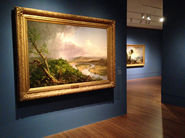  "The Long Run” at New York's Museum of Modern Art is an exhibition encompassing works by nearly 50 artists who were active in modern art during the second half of the 20th century. The artists include numerous famous names such as Jasper Johns, Roy Lichenstein, Andy Warhol and Georgia O'Keefe. The works exhibited are examples of work done later in these artists' careers.
Rejecting the notion that innovation in art is “a singular event—a bolt of lightning that strikes once and forever changes what follows,” the exhibit seeks to show that “invention results from sustained critical thinking, persistent observation, and countless hours in the studio.” The exhibit seeks to illustrate its thesis by presenting works that show the evolution of the artists' works past the time when they were first recognized. One cannot seriously debate the exhibit's thesis. The notion of an artist being struck with a bolt from the blue that leads to a new direction in art is more the stuff of Hollywood drams than reality. As in other siciplines, artists develop their thoughts over time. Skills are refined and new materials are encountered that enable the artist to do new and/or different things, At the same time, personal relationships may be changing, new associations formed and events in the outside world may occur that influence the artist's thinking. Not only is there an evolutionary trail leading up to an artistic breakthrough but there is a trail after that breakthrough. The exhibit shows that artists evolve in different ways. Some artists make radical changes in style. For example, in 1969, Phillip Guston abandoned the abstract style that he had been known for in favor of a more figurative style. He said that he needed to make this change in order to enable him to address the political and social issues of the day. Other artists continue on in the same vein that first brought them recognition. For example, Andy Warhol's black and white drawing of Da Vinci's Last Supper with various colored consumer product logos superimposed makes essentially the same point as his earlier paintings of Campbell's Soup cans, i.e., the commercialization of western society. Along the same lines, Roy Lichenstein's “Interior with Mobile” is similar in style to his earlier comic strip inspired works. Even for those artists who stayed close to their original style, the exhibit makes the point that these artists went on working throughout their lives. In some cases, the later works may not have be as important to the history of art as their earlier works but these artists continued to produce vibrant and worthwhile art. Leaving aside the thesis of the exhibit, the Long Run is still an enjoyable exhibit. It brings together numerous examples of good modern art. This includes lesser known examples by major artists that deserve to be brought to the public's attention. “Tarsila do Amaral: Inventing Modern Art in Brazil” at the Museum of Modern Art presents the work of the artist who led the development of the modernist movement in Brazil. During the 1920s, Tarsila, as she is widely known in Brazil, developed a distinctive style that was truly Brazilian. MOMA has assembled over 100 works drawn from various collections including some of her landmark paintings to document this development. Tarsila was born in Capivari, a small town near Sao Paulo, Brazil in 1886. Her family owned coffee plantations. Although it was unusual at that time for girls from affluent families to pursue higher education, Tarsilia was allowed to pursue her interest in art, both in Brazil and in Barcelona, Spain. Her instructors were conservative, academic artists. In 1920, after the end of her first marriage, Tarsila went to Paris in 1920 to study at the prestigious Academie Julian. Her studies were again in the academic tradition. Meanwhile, a modern art movement had taken root in Brazil. The landmark Semana de Arte Moderna was a festival that called for an end to academic art. Upon Tarsila's return to Brazil, she discovered modern art became a leader in this movement, one of the five artists and writers in the Grupo dos Cincos. In 1922, she returned to Paris and studied with several Cubist artists including Ferdinand Leger and Andre Lehote. However, she continued to think in terms of Brazil. She painted “A Negra,” an abstract portrait of an Afro-Brazilian woman. Returning to Brazil, she embarked upon a tour around the country. The drawings of the countryside and everyday life she made while on this journey served as inspiration for later paintings. Her traveling companion was the writer Oswald de Andrade wrote a manifesto “Pau-Brasil” calling for truly Brazilian culture. She married Andrade in 1926. Tarsila made another journey to Paris in 1928 where she came into contact with surrealist art. (It should be noted that Tarsila did not live like a starving artist in Paris. A renown beauty from a wealthy family, she lived a lavish lifestyle, mixing with famous personalities, artists, writers and intellectuals). That same year, she painted “Abaporu” (the man who eats human flesh) as a birthday present for her husband. He used the image for the cover of his “Manifesto of Anthropology,” which called upon artists to cannibalize European culture and other influences in order to create a distinctive Brazilian culture. The painting and the manifesto are considered landmarks in the development of Brazilian culture. Tarsila's family fortune was all but lost as a result of The New York Stock Exchange crash of 1929 and the following Depression. Her marriage to Andrade ended the following year. In 1931, Tarsila traveled to Moscow with her new boyfriend, a communist doctor. There she was influenced by Socialist Realism. Her subsequent work was primarily concerned with social issues. The exhibition at MOMA focuses on the decade beginning with her journey to Paris in 1920. It demonstrates how Tarsila's work evolved incorporating over time elements of Cubism, Brazilian folk art and Surrealism while retaining her own style. Although she was influenced by each of these schools, she did not become part of them. Hers is a distinctive style: flat two dimensional; populated with simplified, distorted figures and landscapes; often with geometric backgrounds. It is also clearly Brazilian, not only in the choice of subject matter but in the selection of colors. In short, it is what Andrade was calling for - - a synthesis of a number of influences producing a truly Brazilian art. The exhibit also includes some works after her trip to Russia. “The Workers” (1933) was one of the first paintings in Brazil dealing with social issues. It reflects the influence of Soviet painting both in subject matter and palette. Incorporation of this soulless style was not a happy addition to Tarsila's arsenal. The work does not have the life of her earlier works and the treatment of the subject matter is much like what numerous other artists were doing at the time. However, it does serve to spotlight how special her work was during the preceding decade. 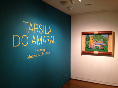 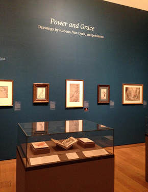 “Power and Grace” at the Morgan Library and Museum is a small exhibition that beings together works on paper by three masters of the Flemish Baroque - - one of art's golden ages. Not only were these three artists contemporaries in Antwerp but they worked together. As seen in their drawings, this relationship clearly influenced their styles.
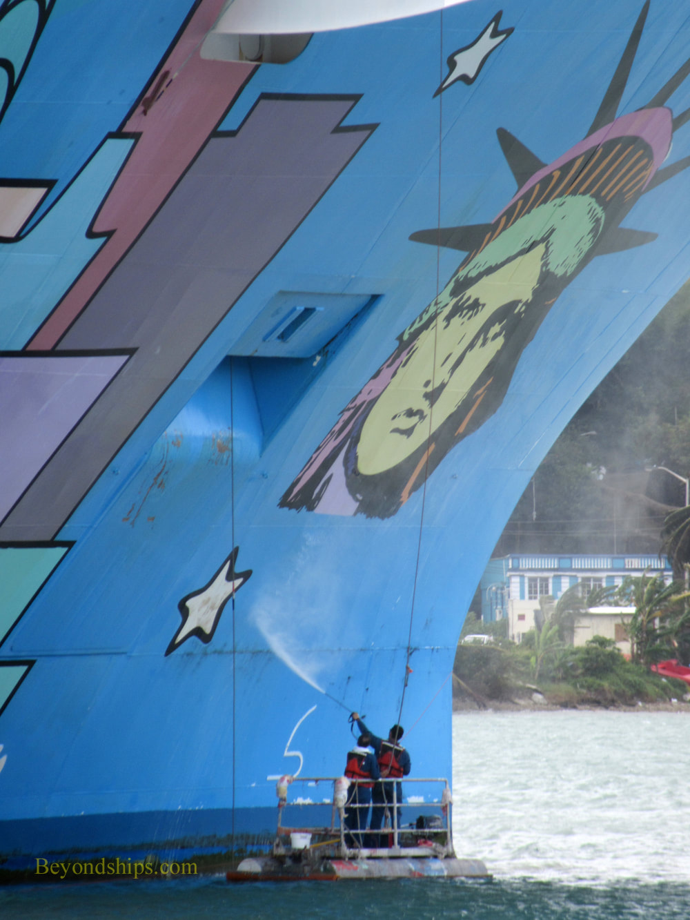
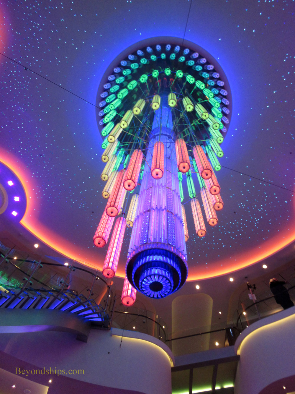
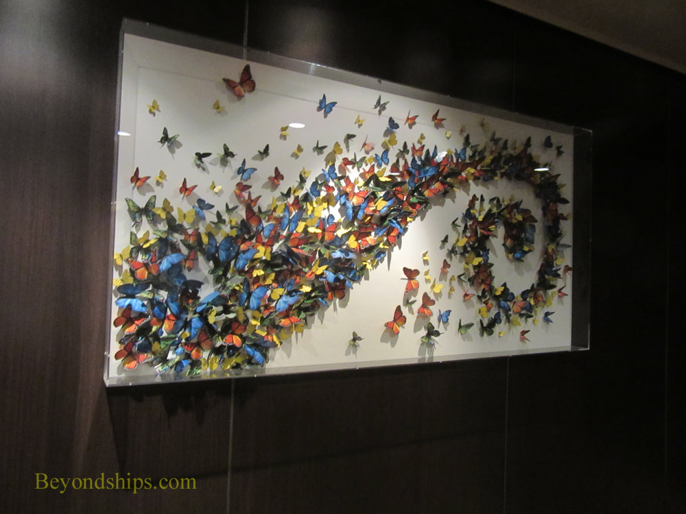
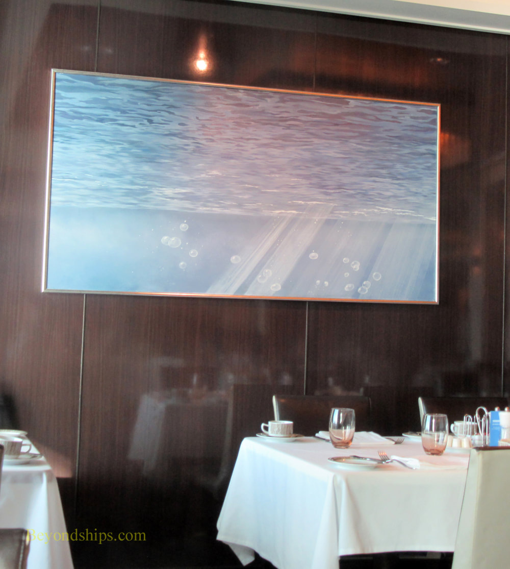
Peter Paul Ruebens was the preeminent artist of his day. Born in Germany, his family moved to Antwerp in the Spanish Netherlands when he was 10 and that city became his base for the rest of his life. The son of a lawyer, his first job at the age of 13 was as a page to a countess but his desire was to become an artist led him to leave this prestigious job. He spent eight years traveling in Italy and Spain studying art. When he returned to Antwerp in 1608, he quickly established himself as a successful artist and was appointed court painter to the archduke and archduchess who governed the Spanish Netherlands on behalf of Spain. In addition to his artistic talent, Rubens was a skilled diplomat. In this role, he traveled extensively in Europe. One such mission took him to England, where he was knighted by King Charles I. He also secured a commission to paint the ceiling of the Banqueting House in London. Thus, he combined diplomacy and art. Rubens developed a large studio. Time did not allow him to do all of the commissions that he received from various royal courts, prosperous merchants and the church. As a result, drawing was very important to him, not only in developing ideas but in order to show his numerous assistants and pupils how he wanted his works completed. Anthony Van Dyck was at one point Rubens' chief assistant. Indeed, the master referred to Van Dyck as the “best of my pupils.” The son or a prosperous silk merchant, Van Dyck was an established painter in his own right by the time he was 15. Like Rubens, Van Dyck went to Italy to study art. Later, probably using recommendations furnished by Rubens, Van Dyck traveled to England. There, he was knighted and became principal painter to Charles I. Commissions poured in from the English court for portraits. Indeed, our image of Engliand's aristocratic society just prior to the English Civil War comes largely from Van Dyck. To handle all of his commissions, Van Dyck maintained a studio of assistants. Following in Rubens' footsteps, Van Dyck used drawings to show his staff his visions. Van Dyck would do a sketch and then it was largely left to the assistant to enlarge it and turn it into a finished painting. How much involvement the master had with each work varied from commission to commission. Like Van Dyck, Jacob Jordaens was born in Antwerp to a prosperous merchant family. Unlike Van Dyck and Rubens, Jordaens did not go to Italy to study art. Indeed, throughout his life, he rarely left Antwerp. Jordeans was nonetheless very influenced by Rubens. At that time, Ruebens was Antwerp's leading artist. On occasion, Rubens would employ Jordeans to enlarge and complete works based upon Rubens' concepts. When Rubens died in 1540, Jordeans became Antwerp's leading painter. (Van Dyck by that time was living in England. Moreover, Van Dyck would die in 1641). The exhibit at the Morgan brings together approximately 30 works on paper from these three masters. Most of the works are from the Morgan's collection but there are some works loaned from other collections. Not surprisingly given the relationship between these three artists, there is a great deal of similarity of style. This is perhaps most evident in three studies of male nudes: Rubens' “Seated Male Youth”; Van Dyck's “Study for the Dead Christ”; and Jordeans' “Study of a Male Nude Seen from Behind “ All are works on colored paper using black chalk heightened by white chalk. In each, the muscles are prominent and handled similarly. There are also examples of preparatory sketches depicting scenes with religious themes. These are interesting for the economy of line that the artists used. Jordeans is the only one who used color but then he began his career using watercolor to create designs for tapestries. All of these artists did portraits but of the three, portraiture is most associated with Van Dyck. Indeed, Van Dyck can be said to have been the primary influence on English portraiture for centuries after his death. The exhibit presents one of his portrait sketches. It is a preparatory sketch for a painting that he did of the wife of a fellow artist and her daughter. Van Dyck took great care and precision with regard to the woman's clothes and jewelry. However, the face again has an economy of line. There is no modeling. Instead, he uses lines to suggest the features and shadows. A second portrait highlights the similarity in styles of these artists. “Portrait of a Young Woman” was for centuries attributed to Rubens. However, in the 1980s, that attribution was questioned and now the expert view is that it is one of the few portraits by Jordeans. Certainly, the use of bold lines and contrast is more similar to Jordeans' works elsewhere in the exhibit; Rubens' works are somewhat more vague. In any case, it is one of the most engaging works in the exhibition.  The centerpiece of Norwegian Breakaway's art collection is not hard to find. It is a work by Peter Max which covers 40,000 square feet of the ship's hull. "The artwork is a composite of New York City and cosmic imagery - -the Statue of Liberty, the Manhattan skyline, a giant sunburst, planets, stars, and musical notes. That's my New York! And now Norwegian Breakaway is my New York cruise ship 'canvas.'" Mr. Max has explained. Although several of the Norwegian Cruise Line ships that preceded Breakaway had colorful murals painted on their hulls, Breakaway was the first ship to have a mural by a well-known established artist on her hull. Mr. Max rose to prominence in the 1960s with his pop art images that captured the spirit of the psychedelic 60s. From that base, he continued to develop a distinctive colorful style through series involving images of the Statue of Liberty and the American flag as well as celebrity portraits. He has also found commercial success being designated Official Artist of five Super Bowls, six Grammy Awards, World Cup USA, The World Series, the United Nations Earth Summit, and numerous other events. His work has also been reproduced on the cover of the Yellow Pages and on a U.S. Postage stamp. The Breakaway project was not Mr. Max's first large scale work. Prior to undertaking the project for Norwegian, he had painted a 777 airliner for Continental Airlines and had designed a 600 foot stage for the Woodstock Music Festival. Of course, Mr. Max did not take a sable-hair brush down to the Manhattan piers and paint the sides of the ship. Rather, he created the design for the work which was then reproduced on the hull of the ship when it was under construction at the Meyer Werft shipyard in Germany. Being outdoors, subject to ocean waves and the blasting of salt spray, Mr. Max's mural is in a hostile environment. In order to maintain the work, Breakaway's crew regularly sprays the hull with fresh water to remove the accumulated salt. When the ship is in port, standing on rafts and using long handled rollers, they also re-touch the paint. This work is done by the sailors of Breakaway's deck department. Mr. Max did not confine his vision to off-the-shelf colors of marine paint. Therefore, Breakaway carries a supply of unique colors needed to maintain the mural. You also see images by Mr. Max inside the ship. Breakaway devotes a considerable amount of its public space to Park West Galleries, which sells works by Mr. Max as well as works by other artists. Naturally, given the ship's connection to Mr. Max, his works are often featured and on display. However, these works belong to the concessionaire rather than to the ship. Finding works that belong to the ship is more difficult, The staircases and elevator lobbies where cruise ships often display their art collections are decorated with mirrors and photographic images of travel destinations on Breakaway. There are reproductions and photographs in the various specialty restaurants and bars. However, these are part of the décor of those venues rather than a serious art collection. But there is an art collection. There is a giant modern chandelier in the atrium that pulses and changes colors in a variety of combinations creating different images and atmospheres. Forward on one of the public decks is an installation with (paper?) butterflies in a cornucopia shape. Also, in the Taste and Savor restaurants are a number of contemporary paintings that appear to be originals. I liked a series of paintings in Taste that look like monochromatic abstractions at first glance but on further study are scenes looking up at the surface of the sea from below. Unfortunately, there is no signage by these works crediting the artists or discussing the works. It is disappointing that Breakaway does not have any ocean liner art like there is on Norwegian's Jewel class ships. Having owned the SS Norway (formerly SS France) and the SS United States, Norwegian has a strong connection to ocean liner history. But on Breakaway, Norwegian essentially cedes this subject matter to Cunard. Along the same lines, although the line uses the slogan “cruise like a Norwegian,” there is no Norwegian art or design on Breakaway, essentially ceding this area to Viking Cruises. With such a rich heritage, it seems like these are missed opportunities.
Above left: Sailors maintaining the Peter Max mural on Norwegian Breakaway. Above right: Breakaway's atrium chandelier changes color. Below left: The butterfly installation. Below right: A painting in the Taste restaurant.
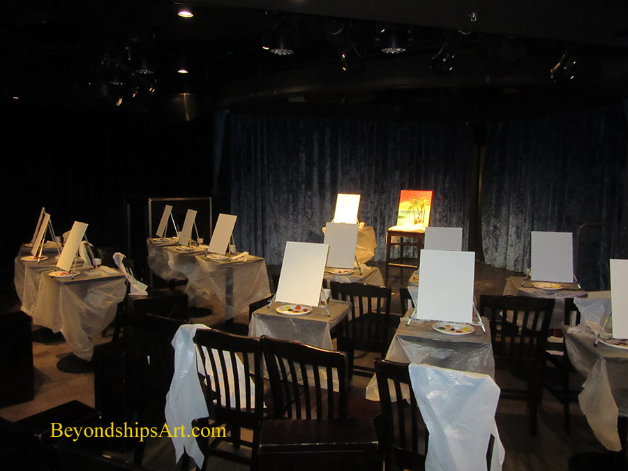
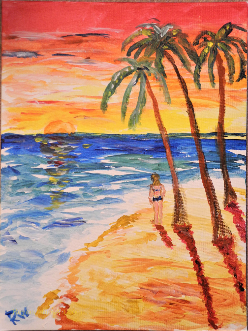
I recently participated in a painting class on Norwegian Breakaway. Entitled Canvas By U, these classes are part of the entertainment programming throughout the Norwegian Cruise Line fleet. These painting classes are a popular activity. Guests must sign up beforehand for a class. This is done via a list in the ship's library. The daily program announces the time when the list will open. On the voyage that I was on, the sign-ups began as soon as the staff member in charge of the library arrived in the morning. Within a few minutes, all of the places are usually filled despite the $35 per class fee.. There are only a dozen or so places for each class. I was told that to have more places would dilute the experience as the instructor would not be able to give enough time to each participant. The number of classes held on each cruise varies. Typically, the classes are held on days when the ship is at sea. Therefore, as a general rule, the more sea days on a given cruise, the greater the number of classes. However, the art classes have to compete with other activities for space and staff so it is not automatic that there will be a class on every sea day. Rather than having professional artists teach the classes, Breakaway uses members of the ship's activities staff who have received training in how to present these classes. While their knowledge of art technique may be limited, they are experienced in working with people and in making activities enjoyable. An effort is made to assign the classes to members of the activities staff who have an interest in art but the instructor for any given class could be any member of the activities staff. The class I attended was held in the Headliners comedy club. Two rows of tables with easels and blank canvases were arranged around the small stage. On the stage was a table with a similar set-up. In addition, there was an easel with a completed painting. Each participant's objective in this class was to make his or her own version of the painting displayed on the stage. The instructor emphasized that while everyone would be painting the same subject, each participant's end-product was to be his or her own painting. Therefore, everyone was encouraged to use their creativity and make whatever variations they wanted. The painting that served as the model in my class was a picture of a tropical island at sunset. It had a colorful red sky, ocean, sand and a grove of palm trees. Different paintings are used as the model for different classes. Thus, a guest could participate in several classes without repeating the same painting. The instructor took the class through the process of painting this picture step-by step. Beginning with the island, she pointed out what color(s) to use, how to mix the paint with water, and which brush to use. She then moved on to painting the sky, the sea, and finally the palm trees. To make these paintings, each participant was equipped with a tray with dollops of a half dozen (tempera) colors, two brushes and a 12 by 16 inch canvas board. In addition, each had a disposable apron and gloves. As the participants painted, the instructor moved about making suggestions and encouraging remarks. There was little conversation between the participants as each was very intent on his or her own painting. From what I could gather, most of the people participating in the class had little or no experience with painting. However, all were interested in painting and were keen to experience what it is like to create a painting. Some displayed a natural talent for painting. All seemed to display a sense of accomplishment as the class drew to a close.
“Within Genres” at the Perez Art Museum Miami relates works from the museum's permanent collection to the categorizes (genres) into which European art was divided from the Renaissance into the 19th century. Inasmuch as the museum's permanent collection focuses on modern and contemporary art, it relates recent art to these traditional categories. In their heyday, the traditional genres were used not just to group and categorize works of art but as a hierarchy. For example, history painting was considered a higher form of artistic endeavor than still life painting or landscapes. The museum asserts that this hierarchy “was challenged in the 19th century with the development of modernism and the avant garde.” Actually, the genre hierarchy was challenged earlier in the 19th century by the Impressionists and by artists such as JMW Turner but in any case, the old academic hierarchy is no longer recognized today. While the hierarchy no longer exists, art is still influenced by the traditional genres. In six exhibit rooms, the museum uses works from its permanent collection to illustrate that recent art can still be related to the traditional categories: Still Life; Landscapes; Scenes of Everyday Life; Portraiture and History Painting. We see that 20th and 21st century artists are still producing works that can be categorized as still lifes, landscapes, scenes of everyday life, portraits and works relating to history. In addition, we see that their approach of these different categories covers a wide range from the traditional to abstraction to concept pieces. The materials used range from traditional oil on canvas to video and installations. While the concept of the exhibit is clearly valid, the exhibit is let down by the small number of works used to illustrate each genre. Contemporary art's roots into the past are more numerous and diverse than the examples show. For example, with the exception of Domingo Ramos' masterful “Landscape with Palm Trees.” (1936) realism during the 20th century is essentially unrepresented. Moreover, the recent move toward realism in contemporary art is all but ignored despite its relation to the art of the past. Still, there are a number of gems in the exhibit. As the museum's signs note, Diego Rivera's “Naturaleza muerta” is a beautiful still life in the tradition of Cezanne. Along the same lines, the signs point out that Roy Lichenstein's abstract silk screen “Water lilies with willows” has roots extending to Monet. Of course, neither Cezanne nor Monet was a traditional academic painter but that just shows that earlier artistic rebels were also influenced by the traditional genres. Like more recent artists, they took their own approach to these genres.  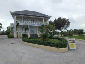 Visitors to The Bahamas mostly come for its great beaches, snorkeling, shopping and of course, the weather. However, there is also a deeper side to these islands and that ongoing story is being told at the National Art Gallery of the Bahamas in Nassau. (See our profile of the NAGB)
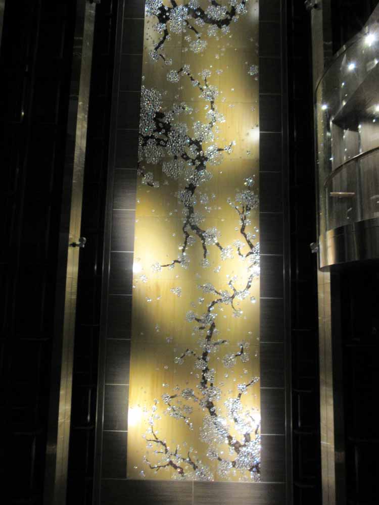
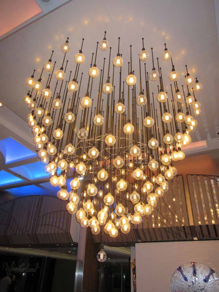
The mission of the National Art Gallery is to develop, collect, and promote a national collection of art for the benefit of Bahamians and the international audience. The easy course for a museum with such a mandate to have taken would have been to view it as a license to go out and collect art from all over the world which would then serve as a general educational tool just as a library purchases books from all over the world. Instead, the museum has chosen to develop and showcase Bahamian art. In doing this, the museum has placed itself in the midst of the conversation about what it means to be Bahamian. Topics such as colonialism, independence, tourism, religion, race, class and immigration are among the many topics dealt with by Bahamian artists. The museum does not impose its own views on these topics but rather lets the artists speak. To illustrate, one form of art that developed before independence in 1973 is picturesque scenes of the islands' natural beauty and scenes of everyday life. Some in the Bahamian art community criticize such works as presenting a superficial view of the islands and catering to "neo-colonial" exploitation of the Bahamas by the tourist industry. However, this uniquely Bahamian art can be viewed as analogous to the American Hudson River School, which showcased to the world the beauty of the young United States without going into the social and political issues then-facing the young nation. Just as the Hudson River works are recognized as valid and important art so too the Bahamanian picturesque. The National Art Gallery provides a forum for such conversations. This does not mean that only Bahamians will be interested in the National Art Gallery. By the end of my visit to the museum, I felt that I knew much more about the complexity of the Bahamian people and the issues they face. This added dimension to my visit to these islands. Furthermore, the works were visually appealing. Because the museum is interested in the full span of Bahamian art, it does not specialize in one particular movement or style of art. During my visit, I saw works that were traditional European style landscapes, contemporary realism, abstract art, folk art, sculpture, conceptual art and works that combined elements of African, European and Caribbean influences. One element that recurred throughout the exhibitions I saw was strong use of color. Perhaps this is a result of the light in the Bahamas, perhaps it is emotion, perhaps it is tradition, perhaps it is a desire to speak boldly but it does seem to be a unifying element. I particularly liked the strong use of color in Ricardo Knowles' “Turtle Cliff”, Dorman Stubbs' “Flamingos” and Lynn Pavoritti's “Mangrovia.” The National Art Gallery of the Bahamas is not a store-front operation but rather a first class facility. It is housed in the historic Villa Doyle. Located just down the street from Government House, Villa Doyle was built as a mansion by Sir William Doyle in the 1860s and served as the home of the first Chief Justice of the Bahamas. It was enlarged by Sir Arthur Moore in the 1920s, becoming one of the premier residences of Nassau. After the colonial era ended, it fell into disrepair. However, in a seven year restoration project, it was transformed into an art museum while preserving the exterior architecture. It was a pleasure to stroll around the landscaped grounds and observe the building. It is particularly commendable for the government and people of the Bahamas to have made such a commitment to art. Few other nations in the greater Caribbean have made such an investment. However, not only does the NAGB provide a vehicle for cultural self-examination by Bahamians but it also lets visitors see that this is a multi-faceted country with great creativity. 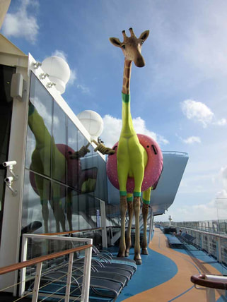 Royal Caribbean's Anthem of the Seas has a sophisticated contemporary décor. In fact, it is often said that the ship's decor looks more like a ship from Royal's premium affiliate Celebrity Cruises than the Las Vegas style décor of some of Royal's earlier ships. Accordingly, the art collection on Anthem is less aimed at eliciting a “wow” and more aimed at contributing to the ship's upmarket atmosphere. Anthem's art collection was assembled in partnership with International Corporate Art. It includes some 3,000 works of art. Almost all are contemporary works. The theme of the collection is “What Makes Life Worth Living.” According to the booklet about the collection, this theme encompasses “people, leisure, fashion, art &literature, food, adventure, entertainment & nature.” This scope is perhaps too broad as it is difficult to discern the theme just by walking around the ship and viewing the various works. However, knowing the theme is not vital to enjoying the art. Several large installations are included in the collection. At the center of ship's public areas is a grand chandelier created by Rafael Lorenzo Hemmer called “Pulse Signal.” It consists of some 200 light bulbs suspended from cords and arranged into a pleasing contemporary shape. The lights blink on and off in various arrangements thus changing the shape of the piece and the atmosphere of the area. It is a visually interesting piece. Guests can control the blinking of the lights by putting their hands on a pad that is located beneath the chandelier. The blinking is then synchronized with the guest's pulse. This does allow for viewer involvement with the art but I find it somewhat gimmicky and unnecessary. Just aft of the chandelier, ascending up the atrium is the prettiest piece in the collection, Ran Hwang's “Healing Garden.” Dark tree branches with bright blossoms are set against a gold background. The work recalls traditional East Asian cherry tree paintings. However, the artist has included non-traditional materials such as crystals, buttons and pins, which give the work a glamorous look. Going further aft, you come to a monumental sculpture by Richard Hudson. It is a swurling mass of highly polished metal. Although entitled “Eve”, it has become widely known as “The Tuba” because of its twisted horn-like shape. Despite this unfortunate nickname, it is an important piece consistent with the upscale shops, the cosmoploitan wine bar and the specialty restaurant that surround the plaza in which it is the centerpiece. You can find works that contribute to Anthem's sophisticated atmosphere throughout the public areas and on the staircases. However, there is also whimsy in the collection. For example, in each of the elevators there is a giant image of an animal. Deming Harriman has manipualted these images so that the various animals are wearing items of human clothing. By adding these items, the artist gives the animals human personalities, making the images both amusing and a commentary on human foilbles. Atop the ship is a larger than life sculpture of a giraffe wearing a swimming costume and an inner tube. Known as “Gigi” this lovable character by Jean Francois Fourtou marks the ship's amusement park area. There is also art along the corridors leading to the passenger cabins. These include contemporary photos staged so as to look like advertisements or scenes from 1950s America. There are also posters with inspirational slogans like the ones that the youth culture used to decorate college dormitories in the 1960s. Overall, the Anthem collection is successful. The theme is perhaps too broad to present a coherent message. However, the pieces are visually pleasing and often thought provoking, Also together, they serve to support the overall atmosphere of the ship. 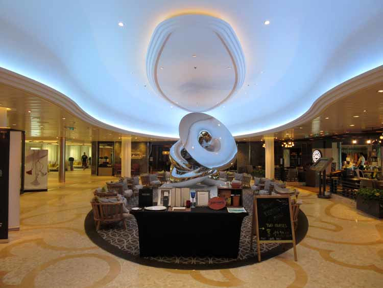 Above: Richard Hudson's Eve provides a centerpiece for one of the ship's plazas. Below left: Ran Hwang's “Healing Garden” in the ship's atrium. Below right: "Pulse Signal" by Rafael Lorenzo Hemmer is in the center of Atrium's public area.
|
AuthorRich Wagner is a writer, photographer and artist. Archives
November 2018
Categories
All
|
 RSS Feed