 Ocean liners have earned a place in history. During the era of ocean liner travel, these ships transported millions of immigrants from Europe to North America and Australia, they provided a transportation link between the nations of the world, carried troops, acted as hospitals during times of war and were at the forefront of technology. Thus, one might well expect to find an exhibition about ocean liners at a history museum.
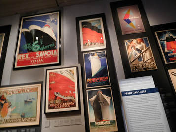
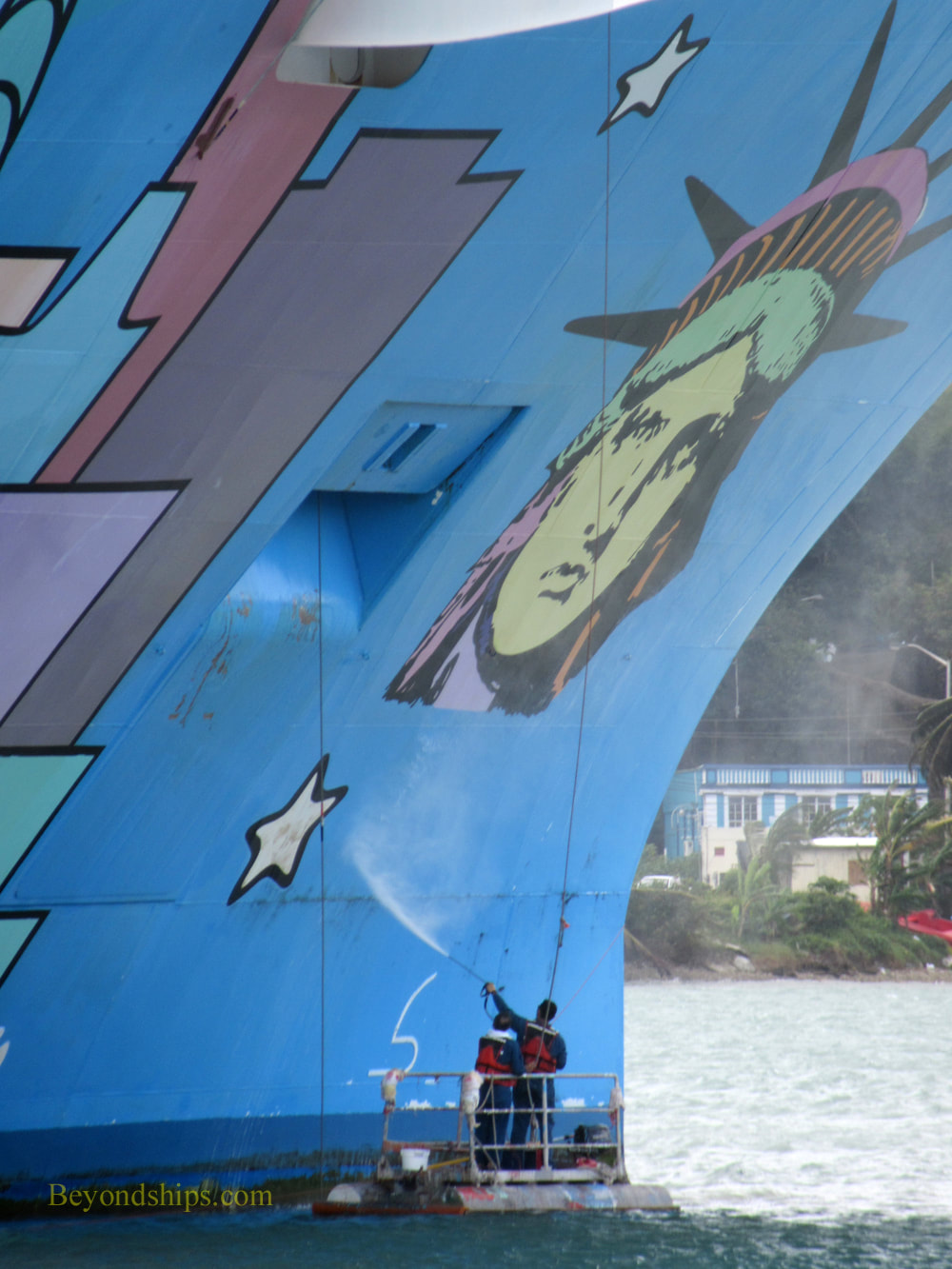
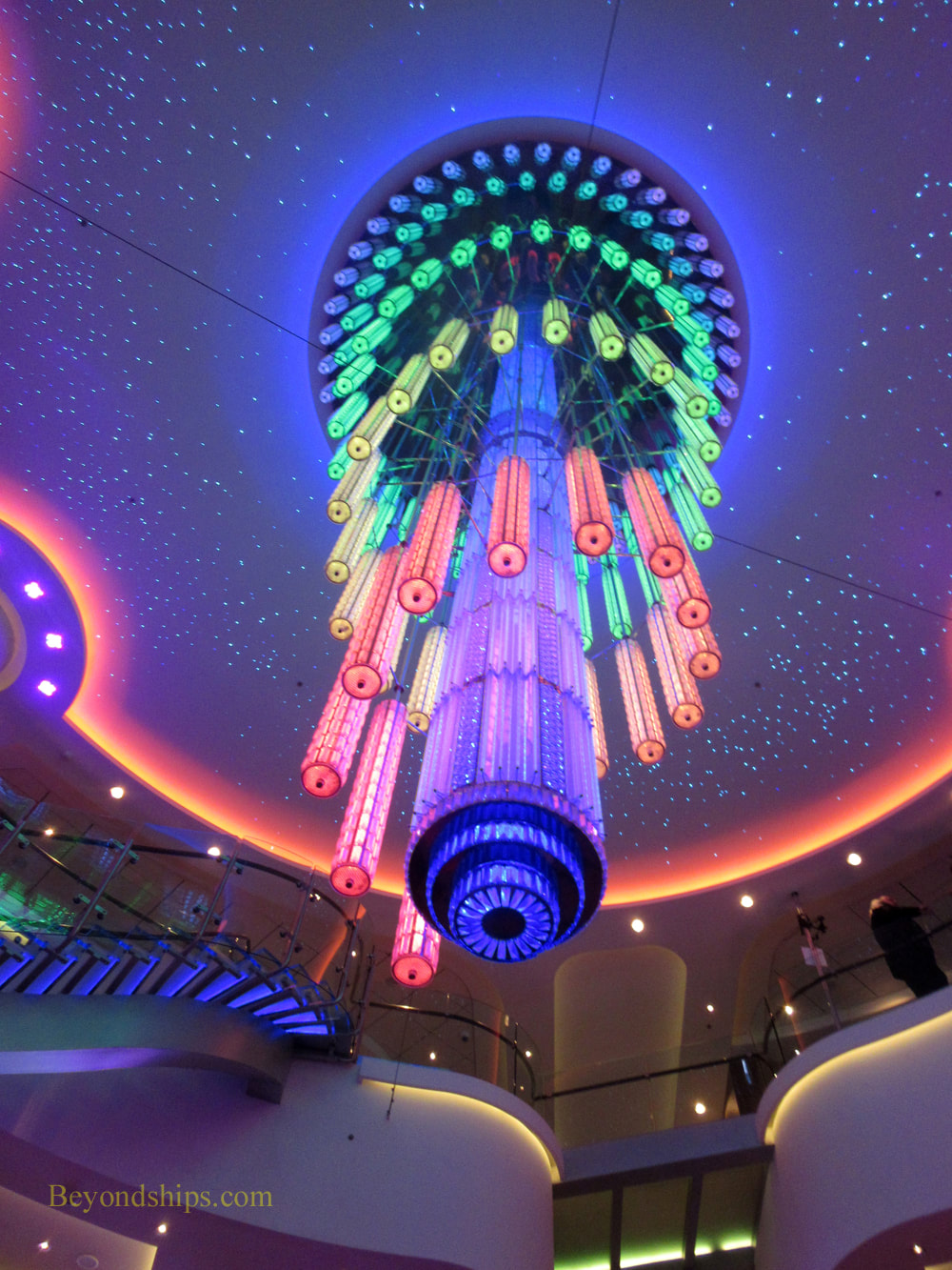
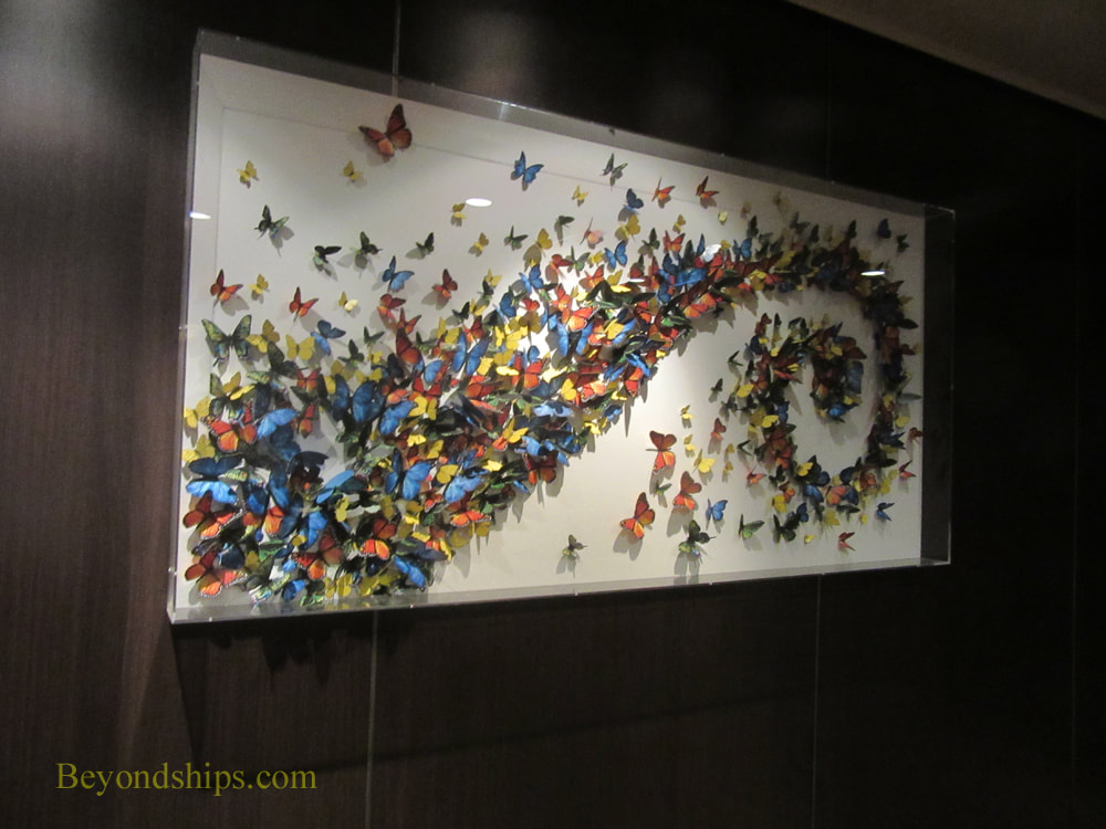
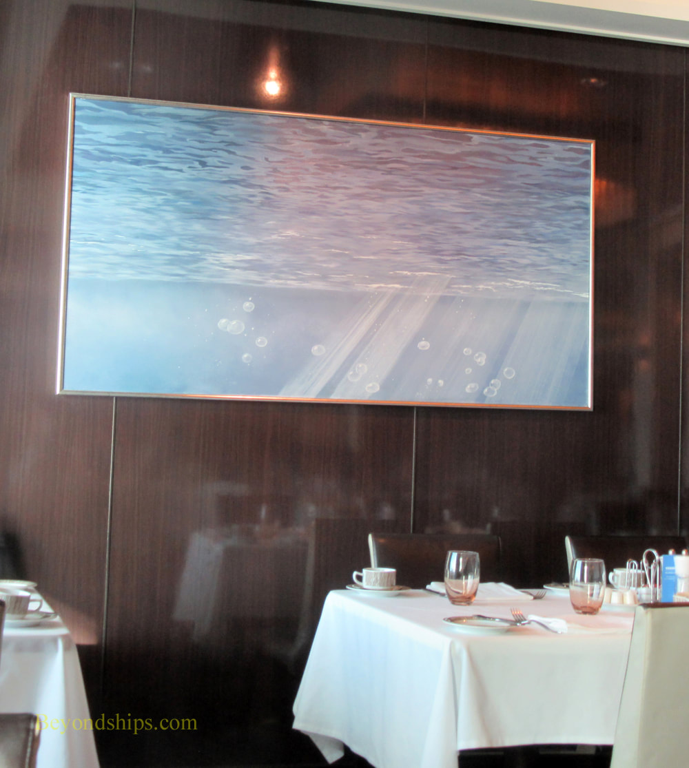
But what do ocean liners have to do with art? “Ocean Liners: Speed and Style” at London's Victoria and Albert Museum explores this question with 250 objects, including paintings, sculpture, and ship models, alongside objects from shipyards, wall panels, furniture, fashion, textiles, photographs, posters and film. Beginning with Brunel’s steamship, the Great Eastern of 1859, the exhibition traces the design stories behind some of the world’s most luxurious liners including the Beaux-Arts interiors of Kronprinz Wilhelm, Titanic and its sister ship, Olympic; the floating Art Deco palaces of Queen Mary and Normandie; and the streamlined Modernism of SS United States and QE2. The answer to the above-stated question is that ocean liners intersected with art in quite a few ways. First, ocean liners intersected with art as architecture. Beginning in the early 20th century, ocean liners grew from being mere vehicles for transportation into environments in which thousands of people lived. Streamlined, they took on lines which influenced architecture both at sea and on land. Similarly, they also influenced the engineering design of the day. Just as a great building is art, so is a great ship. Second, there is interior design. In order to attract passengers, particularly, well-to-do passengers, the ocean liners developed luxurious interiors. At first, the shipping lines sought to imitate the grand hotels ashore but over time they created their own styles. Furthermore, as ocean liners became symbols of national pride, they were filled with artistic treasures. Art Deco works from the 1930s French liner Normandie can now be found in major museums such as the Metropolitan Museum. Similarly, the interiors of Cunard Line's Queen Mary and Queen Elizabeth showcased works from around the British Empire. The examples of ocean liner furniture and paneling included in the exhibition demonstrate the quality of this decoration. Along the same lines, the shipping lines did not just rely on word-of-mouth to attract customers. In order to lure passengers aboard, they created posters and brochures advertising the ships. Whereas today's advertising relies primarily on glossy photographs, these advertisements often involved drawings and other artistic depictions of the ships and life at sea. In addition, the graphic layouts were often artistic. The ocean liners also influenced fashion. During the Golden Age of Ocean Liner travel, people dressed while at sea. Elegant gowns, dinner suits, blazers and day wear were necessities for a first class voyage. Passengers displayed the latest designs and designers were inspired to create new designs. Examples of fashions worn aboard ship are included in the exhibition such as a Christian Dior suit worn by Marlene Dietrich as she arrived in New York aboard the Queen Mary in 1950 and a striking Lucien Lelong couture gown worn for the maiden voyage of Normandie in 1935. At the same time, artists were inspired to create works featuring ocean liners. These included not just traditional maritime paintings of ships but also abstract works. Several Cubist-style works are included in the exhibition. Filmmakers were also inspired by the ocean liner image. The exhibition presents clips from a number of major motion pictures that were either about or set on ocean liners. Overall, the exhibition provides a good introduction to ocean liners and their artistic significance. Along the way, it introduces the major ships and it tells their story. The lighting and use of technology also enhance the exhibition. 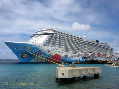 The centerpiece of Norwegian Breakaway's art collection is not hard to find. It is a work by Peter Max which covers 40,000 square feet of the ship's hull. "The artwork is a composite of New York City and cosmic imagery - -the Statue of Liberty, the Manhattan skyline, a giant sunburst, planets, stars, and musical notes. That's my New York! And now Norwegian Breakaway is my New York cruise ship 'canvas.'" Mr. Max has explained. Although several of the Norwegian Cruise Line ships that preceded Breakaway had colorful murals painted on their hulls, Breakaway was the first ship to have a mural by a well-known established artist on her hull. Mr. Max rose to prominence in the 1960s with his pop art images that captured the spirit of the psychedelic 60s. From that base, he continued to develop a distinctive colorful style through series involving images of the Statue of Liberty and the American flag as well as celebrity portraits. He has also found commercial success being designated Official Artist of five Super Bowls, six Grammy Awards, World Cup USA, The World Series, the United Nations Earth Summit, and numerous other events. His work has also been reproduced on the cover of the Yellow Pages and on a U.S. Postage stamp. The Breakaway project was not Mr. Max's first large scale work. Prior to undertaking the project for Norwegian, he had painted a 777 airliner for Continental Airlines and had designed a 600 foot stage for the Woodstock Music Festival. Of course, Mr. Max did not take a sable-hair brush down to the Manhattan piers and paint the sides of the ship. Rather, he created the design for the work which was then reproduced on the hull of the ship when it was under construction at the Meyer Werft shipyard in Germany. Being outdoors, subject to ocean waves and the blasting of salt spray, Mr. Max's mural is in a hostile environment. In order to maintain the work, Breakaway's crew regularly sprays the hull with fresh water to remove the accumulated salt. When the ship is in port, standing on rafts and using long handled rollers, they also re-touch the paint. This work is done by the sailors of Breakaway's deck department. Mr. Max did not confine his vision to off-the-shelf colors of marine paint. Therefore, Breakaway carries a supply of unique colors needed to maintain the mural. You also see images by Mr. Max inside the ship. Breakaway devotes a considerable amount of its public space to Park West Galleries, which sells works by Mr. Max as well as works by other artists. Naturally, given the ship's connection to Mr. Max, his works are often featured and on display. However, these works belong to the concessionaire rather than to the ship. Finding works that belong to the ship is more difficult, The staircases and elevator lobbies where cruise ships often display their art collections are decorated with mirrors and photographic images of travel destinations on Breakaway. There are reproductions and photographs in the various specialty restaurants and bars. However, these are part of the décor of those venues rather than a serious art collection. But there is an art collection. There is a giant modern chandelier in the atrium that pulses and changes colors in a variety of combinations creating different images and atmospheres. Forward on one of the public decks is an installation with (paper?) butterflies in a cornucopia shape. Also, in the Taste and Savor restaurants are a number of contemporary paintings that appear to be originals. I liked a series of paintings in Taste that look like monochromatic abstractions at first glance but on further study are scenes looking up at the surface of the sea from below. Unfortunately, there is no signage by these works crediting the artists or discussing the works. It is disappointing that Breakaway does not have any ocean liner art like there is on Norwegian's Jewel class ships. Having owned the SS Norway (formerly SS France) and the SS United States, Norwegian has a strong connection to ocean liner history. But on Breakaway, Norwegian essentially cedes this subject matter to Cunard. Along the same lines, although the line uses the slogan “cruise like a Norwegian,” there is no Norwegian art or design on Breakaway, essentially ceding this area to Viking Cruises. With such a rich heritage, it seems like these are missed opportunities.
Above left: Sailors maintaining the Peter Max mural on Norwegian Breakaway. Above right: Breakaway's atrium chandelier changes color. Below left: The butterfly installation. Below right: A painting in the Taste restaurant.
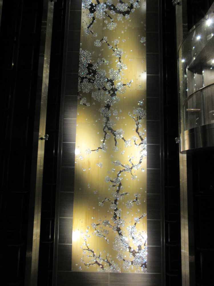
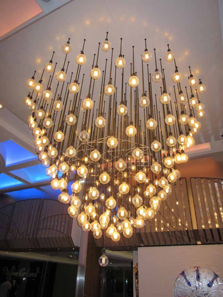
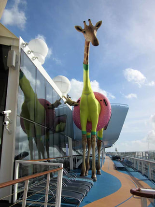 Royal Caribbean's Anthem of the Seas has a sophisticated contemporary décor. In fact, it is often said that the ship's decor looks more like a ship from Royal's premium affiliate Celebrity Cruises than the Las Vegas style décor of some of Royal's earlier ships. Accordingly, the art collection on Anthem is less aimed at eliciting a “wow” and more aimed at contributing to the ship's upmarket atmosphere. Anthem's art collection was assembled in partnership with International Corporate Art. It includes some 3,000 works of art. Almost all are contemporary works. The theme of the collection is “What Makes Life Worth Living.” According to the booklet about the collection, this theme encompasses “people, leisure, fashion, art &literature, food, adventure, entertainment & nature.” This scope is perhaps too broad as it is difficult to discern the theme just by walking around the ship and viewing the various works. However, knowing the theme is not vital to enjoying the art. Several large installations are included in the collection. At the center of ship's public areas is a grand chandelier created by Rafael Lorenzo Hemmer called “Pulse Signal.” It consists of some 200 light bulbs suspended from cords and arranged into a pleasing contemporary shape. The lights blink on and off in various arrangements thus changing the shape of the piece and the atmosphere of the area. It is a visually interesting piece. Guests can control the blinking of the lights by putting their hands on a pad that is located beneath the chandelier. The blinking is then synchronized with the guest's pulse. This does allow for viewer involvement with the art but I find it somewhat gimmicky and unnecessary. Just aft of the chandelier, ascending up the atrium is the prettiest piece in the collection, Ran Hwang's “Healing Garden.” Dark tree branches with bright blossoms are set against a gold background. The work recalls traditional East Asian cherry tree paintings. However, the artist has included non-traditional materials such as crystals, buttons and pins, which give the work a glamorous look. Going further aft, you come to a monumental sculpture by Richard Hudson. It is a swurling mass of highly polished metal. Although entitled “Eve”, it has become widely known as “The Tuba” because of its twisted horn-like shape. Despite this unfortunate nickname, it is an important piece consistent with the upscale shops, the cosmoploitan wine bar and the specialty restaurant that surround the plaza in which it is the centerpiece. You can find works that contribute to Anthem's sophisticated atmosphere throughout the public areas and on the staircases. However, there is also whimsy in the collection. For example, in each of the elevators there is a giant image of an animal. Deming Harriman has manipualted these images so that the various animals are wearing items of human clothing. By adding these items, the artist gives the animals human personalities, making the images both amusing and a commentary on human foilbles. Atop the ship is a larger than life sculpture of a giraffe wearing a swimming costume and an inner tube. Known as “Gigi” this lovable character by Jean Francois Fourtou marks the ship's amusement park area. There is also art along the corridors leading to the passenger cabins. These include contemporary photos staged so as to look like advertisements or scenes from 1950s America. There are also posters with inspirational slogans like the ones that the youth culture used to decorate college dormitories in the 1960s. Overall, the Anthem collection is successful. The theme is perhaps too broad to present a coherent message. However, the pieces are visually pleasing and often thought provoking, Also together, they serve to support the overall atmosphere of the ship. 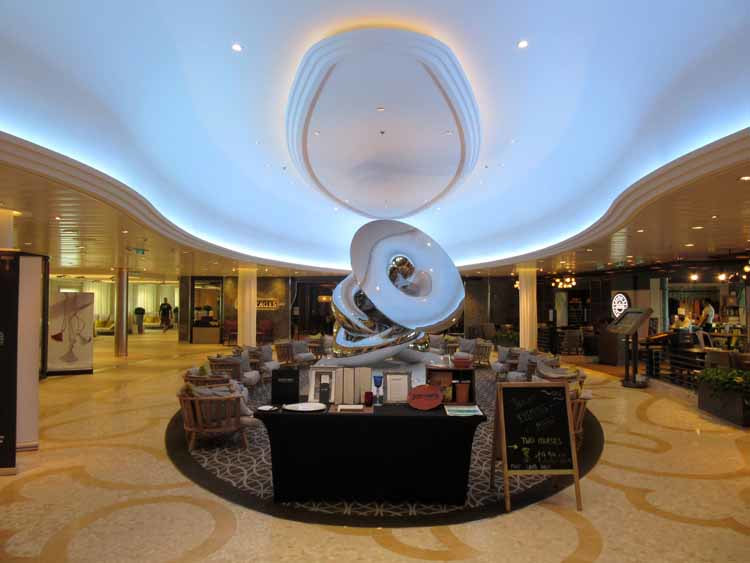 Above: Richard Hudson's Eve provides a centerpiece for one of the ship's plazas. Below left: Ran Hwang's “Healing Garden” in the ship's atrium. Below right: "Pulse Signal" by Rafael Lorenzo Hemmer is in the center of Atrium's public area.
This week, we take a look at the art collection on the cruise ship Celebrity Reflection. Celebrity Cruises has been collecting art and displaying art on its ships since its founding. Credit for beginning the Celebrity Art Collection in the 1990s is usually give to Christina Chandris, wife of John Chrandis then the owner of Celebrity Cruises. The line has since been purchased by Royal Caribbean Cruises Ltd. but the tradition of having an art collection aboard the ships continues. Responsibility for assembling the art collection on Celebrity Reflection, which entered service in 2012, was given to a firm called International Corporate Art. As when Ms. Chandris began the collection, the works on Celebrity Reflection are contemporary. They are primarily conceptual with much use of photographic images and non-traditional materials. There is almost no use of traditional techniques such as drawing or painting. The collection is prominently displayed. Indeed, there are several large installations that occupy considerable space. The works on the forward and aft stair towers are beautifully lit and dominate the landings. Clearly, the art collection was not an after thought. Since the name of the ship is Reflection, the theme of the collection is “the seductiveness of reflection.” The term “reflection” is meant both in the literal sense of surfaces that reflect light and in the metaphysical sense of thinking (reflecting) on a topic. If you look for this theme in the works, you can find it but it is not really vital to appreciating these works. Next to each work is a plaque discussing the work. These tend to be somewhat enthusiastic, using strings of adjectives and phrases which meld together to become rather meaningless. They obscure rather than clarify but that is often the case with the art establishment. Good art does not require verbose explanations. Each of Celebrity's Solstice class ships has a living tree suspended in the central atrium. On Reflection, this centerpiece was designed by Bert Rodriguez. The tree grows upward out of a shiny metallic basin. On the bottom of the basin is an aluminum tree pointing downwards. In other words, the aluminum tree is like a reelection of the living tree. However, unlike the living tree, the man-made tree is without leaves, only colorless electric lights adorn its branches. Another major installation is located by the specialty restaurants. On either side of the corridor are large photographic images from a forest. However, each of the trees has been perforated with reflective materials in each of the holes. Thus, you can glimpse your image moving through the forest as you pass by. It is visually impressive. The artist was Albano Afonso. Not far away is another installation, the Celestial Garden by Carlos Betancourt in collaboration with Alberto Latorre.. Colorful flowers contrast cover the walls, ceiling and floor, set against dark, nearly black backgrounds. Quite pretty. A shiny, abstract-shaped bench provides the reflective element. Of the works in the stairtowers, I found the photographic images by Miranda Lictenstein the most appealing. She manipulates the images so that they become essentially unrecognizable forming abstract designs. Her choice of pastel, natural colors in these images, however, makes them attractive. I was also impressed by the life-size silhouette at the top of this same tower, a photographic image by Yuki Onodera. The sparkling lights on the woman's dress are actually fragments of other photographic images. I did not find everything in the Celebrity Reflection collection appealing. However, I did find the collection thought provoking. I could not dismiss any of the works out of hand. Rather, I had to think about why I did not like a particular work. Causing viewers to think is a hallmark of a good collection.
Above left: "Untitled #2", "Untitled #4" and Untitled #7" by Miranda Lichtenstein in the aft stair tower.
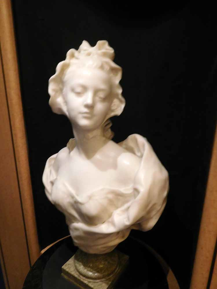
Above right: An installation by Albano Afonso. Holland America Line is one of the cruise lines known for investing in art for its ships. The line attracts well-educated passengers who appreciate culture and a sophisticated atmosphere. Consistent with this, the Holland America ships feature museum quality art collections. The art is not presented as in a museum or a gallery. Although there are plaques next to each work giving information about the artists and the work, the works mix in with the overall décor of the ships' public areas. Recently, I sailed on Holland America's Oosterdam. As discussed below, that ship's collection can be divided into three categories. First, the ship has quite a few works by contemporary artists. Chief among these is a series of maritime paintings by Stephen Card. On each landing of the ship's forward staircase is a large oil on canvas depicting ships that have sailed for Holland America line. The style is traditional and understated. Although accurate, these are not mechanical drawings but rather scenes of the ships in various locations under various weather conditions. They evoke the spirit of the sea and invite the viewer to enter into the scene. Card is clearly the leading contemporary maritime painter. Holland America has an arrangement under which musicians are supplied to Holland America's ships by the late BB King's organization. Just outside where the BB King All-Stars play on Oosterdam are a series of sketches by Wil van der Laan depicting Mr. King and other musicians. The style here is free and loose capturing visually the energy of the musical performances. The second category in the Oosterdam's collection are contemporary works inspired by or done in styles of the past. For example on the landings of the midships stairway are a series of large medallions by Lebigre & Roger that are essentially enlargements of coins issued by the Dutch East India Company between 1600 and 1800. The same artists also created a set of traditional bronze Commedia dell' Arte figures, which are also in Oosterdam's collection. Each of the Holland America ships has a large maritime painting done in traditional Dutch style. On Oosterdam, this monumental work is an oil on aluminum called “Maritime Relations” by Cees Muller. It depicts a Baroque era city with numerous sailing ships in the waters surrounding the city. The final category of works is antiques. Most of these works are European sculptures. Although by lesser known (or unknown) artists, these works are of good quality and help to create a more refined atmosphere aboard the ship. I particularly liked the charming small marble bust of a woman by Henri Weigele from 19th century France.
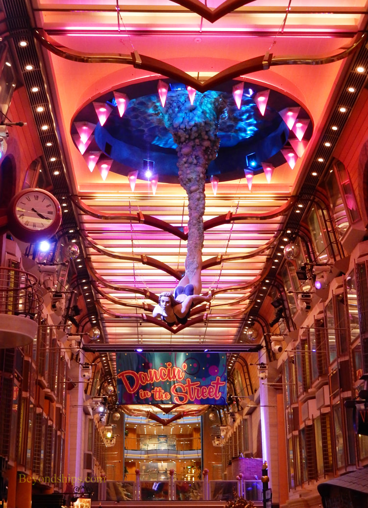
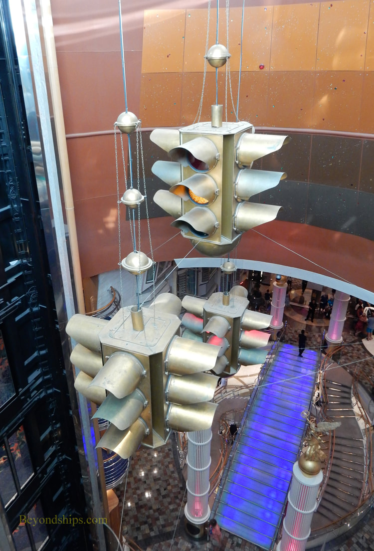
When I go on a cruise, I look for places to see art in the various ports of call. However, sometimes you can see art without ever leaving the ship. This is because some cruise lines have invested in quality art collections on their ships. Here, I am not talking about the art that is sold on board through a concessionaire. Nor am I talking about travel photos placed in the hallways for decoration. Rather, I am talking about art collections that typically cost the cruise lines millions of dollars. Cruise ships with significant art collections are not limited to the luxury or premium cruise lines. For example, Royal Caribbean's Freedom of the Seas is a popular cruise ship targeted primarily at mass market consumers. Yet, it has an art collection that cost millions and which took considerable effort to develop. Freedom is a big, brightly decorated ship geared toward an active and energetic cruise experience. Accordingly, its art collection features contemporary works, often with pop art influences. The art works are located in the ship's public spaces, the stair towers and in the corridors leading to the staterooms. The collection was put together in consultation with International Corporate Art. It was developed around a theme - - “the four basic elements that comprise the universe: Earth, Fire, Water & Air.” The theme is not always readily apparent in the works but it is not really essential to appreciating the collection. The heart of the ship is the Royal Promenade, a multi-story passage running 445 feet and linking two atriums. With shops, bars and eateries along either side, it resembles a city street or a Las Vegas style mall. Suspended from the ceiling midway down the Royal Promenade is the ship's most prominent art installation - - “Down Under,” a giant sculpture of a young woman who has just dove into the sea. Since you are looking up, you see her from the perspective of someone standing on the sea floor. British sculptor David Mach used fiberglass and steel to create this colorful piece. In the forward atrium is another installation consisting of models of three fighter jets soaring upwards. They are in formation, about to peel off in different directions as in an air show. While spectacular while viewed from the base of the atrium, when you view the work from the upper decks, you see that the airplanes are decorated with fragments of images taken from frescoes by 18th century Venetian artist Giambattista Tiepolo. These images, taken from churches and placed on instruments of war, turn “Komba Tiepolo 30, 31 and 32” by Antonio Riello into a provocative statement. At the other end of the Royal Promenade is a bridge with two lighted columns at each end. Atop each of the pillars is a copy of the Vittoria Alata (Winged Victory) statue in the Vittorio Emanuele Monument in Rome. In this work by Larry Kirkland, each of the pillars is meant to represent one of the four elements, the theme of the collection. In the atrium just beyond the bridge is another installation – two large bronzed traffic lights. This is “Stop and Go” by Harald Vlugt. Not all of the works on Freedom are monumental. Each landing in the stair towers contains works on a smaller scale. Most often these are photographs but these also include sculptures made with a variety of different materials. To me, perhaps the most interesting works are in the corridors by the staterooms. Here, you can find works done in more traditional ways including prints and drawings. Unfortunately, the signage here is not as good as in the main public areas and so it is difficult to identify some of these works and the artists. Since Freedom came into service in 2006, there have been a number of changes to her public areas. As a result, some of the works that were originally on the ship have been removed. However, it still is interesting to explore the art of Freedom of the Seas.
Above left: David Mach's "Down Under" dominates the Royal Promenade on Freedom of the Seas.
Above right: Suspended in the aft atrium is Harald Vlugt's "Stop and Go." Seen in the background below the aforementioned installation is Larry Kirkland's "The Four Elements". |
AuthorRich Wagner is a writer, photographer and artist. Archives
November 2018
Categories
All
|
 RSS Feed